User Experience is the Daily Renewal of Enthusiasm

“Sales is Simply the Transferral of Enthusiasm”

That’s what I heard at the recent IBM PureSystems event I demo’d and spoke at. It resonated with me because, while I’m not a sales guy, I do spent a lot of my time transferring my enthusiasm for IBM Flex System Manager to those that use it and sell it. In fact, my recent trip to Shanghai and Dubai was solely because I have a way to successfully transfer enthusiasm through demonstrating and speaking about Flex System Manager that makes both end users and sellers excited about the product.

However, what I am discovering is that regardless of how successful I am at transferring my enthusiasm to others, their new-found enthusiasm will fade fade quickly if it is not continually renewed.

How is enthusiasm for a product best renewed?

Through its user experience.

I am finding with our latest release of FSM that our new user experience is being very well received by both users and sellers alike. It is this new user experience that is renewing their enthusiasm every day, not the memory of a well-executed demonstration.

Think about it: How many times have you seen an online video or in-store demo of a product and you get so excited to use it you quickly part ways with your money so you can bring it home…only to discover that the product is far too difficult to set up and use for your particular needs? I know I have … especially with music software. The bullet points are exactly what I need to accomplish my goals, but the interface is so confusing I end up uninstalling and wishing I had not been suckered in by the flashy demo.

Maybe that is the ultimate litmus test for a product…for the user experiences I own: Can the level of enthusiasm I transfer to sellers and end users during the initial demo be constantly renewed by the user experience they interact with every day after?

What do you think?

Tell A Story With Our Designs – For A Better Future?

I love to write songs.

My best songs are story-based…you know, in verse one we meet the character, the bridge describes what their struggle is, and the first chorus what they’re feeling. Verse two brings in detail or a new wrinkle to the story, followed by a slightly altered chorus that applies to the situation. Of course after that is a killer guitar solo, and then verse three or a B-section brings a surprising twist…that not only makes the song memorable, but by the end of the final chorus makes the listener think about how it applies to their life in hopes that they will become a little bit better person.

I’m starting to wonder: should our user experience designs tell a compelling story, too?

In this case, instead of the story being about a character we hope the listener likes, the story told by our designs would be about the users data, or their systems, or even the users status updates, photos, and chats. We know these are things our users are already passionate about and they are rooting for to win!

…so why do some of my designs seem like a documentary? “Hmm, your system is this, that, the other thing. You data takes up this much space.” …Distant…sterile…

…Boooooring.

In these standard designs, there is nothing to connect our user emotionally to their data/systems…nothing to draw them in so they WANT to invest their time helping the story along.

Instead, what if I told a story? What if I introduce their systems as characters in a story…knowing that there are challenges ahead, relationships to nearby networks and storage that deepen the story? What if I make the user interface react to what the characters want instead of asking what the humans that use the product want?

For example, I currently define a target user (persona) along with what goals they have. I then design the software to help the human accomplish their humans goals. What if I turned it around and defined my central character as the users data or the systems they are managing, and then showed in the UI what the characters need?

I know the first push-back would the classic rule saying that I shouldn’t personify a non-living object…

…but what if this is what our next-generation of IT professionals need?

Maybe our future IT professionals need software that help them relate to the datacenter systems…help them connect on some emotional level so they will want follow the systems status, help the system through struggles, and feel empowered and feel some deep satisfaction when their systems succeed and thrive.

Stories have been powerful tools to help motivate and capture human attention for centuries…maybe it’s time we start telling stories with our software?

What do you think?

What if we started our software experience with, “Once upon a time…”?

3 Steps To Get Started In Social Media

Recently I was asked, “What does it take to get started in Social Media as a corporate employee?”. Here’s my response…

~~~~~~~~~~~

That’s easy: It will take 10 minutes per month — from 12:50-1:00 p.m. central time — on the third Thursday, to be successful in social media.

OK so it’s not quite that simple. The real answer is that it takes three steps:

  1. Define Your Goal
  2. Have Balance
  3. Be Consistent

Define Your Goal
Before you start anything in social media, you need to define your goals. Once you have a clear picture of why you want to engage in social media, you need to be honest about how much time that would require.

For example, if your goal is to help an occasional user, you could, in fact, spend only 10 minutes per month reading your go-to forum and responding to individual questions about a topic you know about. However, if your goal is to be known in the industry as an expert, you could spend an hour per week creating your own technical blog to provide others in the industry tips and insight based on your experiences.

Have Balance
It really is up to you how frequently you are involved with social media, but make sure you can balance your social media effort with what you’re currently doing in your work.

Here are some example guidelines I have used to keep balanced while working towards my goal:

  • Blog: Post at least once per month. The more frequent, the shorter the posts can be. I find 300-500 words is ideal as users want to gain insight but not spend a lot of time reading
  • Tweet: Tweet at least once per week. Followers want regular insight. Think about making it a ‘tip of the week’.
  • YouTube: Post an educational/demo video once every 2 months. Make them short, and have them cover only one key topic.
  • Online in-depth article: Once per quarter since these are generally much longer and have a wider distribution.

Tip: When you feel like writing, work ahead! You will feel much better if you have a collection of blogs/tweets/videos that are publish-ready and can be scheduled using many available tools, rather than scrambling to meet the next deadline.

Be Consistent
The reality is that to be engaged in social media, you need to be consistent with how often you interact. Nothing is more useless than a stale blog or channel. If you think it might be ‘too much’, get a small team together to share the responsibilities. That way the frequency for you can be less but your followers still get the consistent cadence.

Regarding duration: Social media is an ongoing interaction. If you stop, your digital presence will fade. As long as your frequency is consistent, your social presence will stay, but there really is no ‘end date’. If your followers do not see regular updates, they will stop looking for your content. In my experience, if your goal is to help your customers gain insight into a product or service, make the blog/handle reflect the product name so if you move on to another job, someone else can take over the social media outlet and your customers can still gain insight from a new expert.

Finally, don’t forget to interact with your customers through comments. I often create content, but then forget that the real value of social media is in the conversation that happens between you and your subscribers in the comments section. This will not only keep things personal, it will grow your social media presence.

Question: How do you approach social media?

Travel Tip #237: Share The Power

An airport is really a kingdom of its own…unique in its inhabitants, food, culture, and currency.

The most valuable currency at an airport is…

…power.

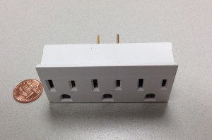
Yep, the glorious 3-holed wonder that gives your devices the chance to charge before you take off in a metal tube to your world-wide destination. Sure, you can hope for a seat with power on long flights (or plan ahead with seatguru.com), but those are virtually nonexistent on domestic flights.

I, like most other travelers, regularly scour the airport for an open outlet…usually defeated since there are so few available…until 2 years ago when my seasoned travel buddy showed a magical currency-generating object…

The mini-power strip.

PowerOutlet

Now, with mini power strip in tow, I casually walk with my coffee looking for an outlet. When I find one, almost always fully used, I sit down, tap on the shoulder of an currency-rich member of this crazy kingdom and ask: Mind if we share the power?

“Sure!”, I usually hear back.

“Wow, what a great idea!”, I sometimes hear back.

“You must be a genius inventor!”, I never hear back.

The mini power strip not only reduces the stress of your travel, it lets others experience your resourcefulness and preparation since the mini power strip usually allows for not just you to share already-used power, but possibly one or two others nearby.

Oh, and it only adds an ounce or two to your bag.

Give it a try!

Question: What hidden gem do you bring when you travel that you find useful?

Flip Your Focus: Serve Customers Through Social Media

Recently I was asked “Can you explain the professional benefits for a corporate employee engaging in social media?”

My response surprised me, and I thought you might find it interesting as well…

~~~~~~~~~~

Engaging in social media professionally does benefit you directly, but as I think through my experience, I find it becomes especially rewarding when you flip the focus from how it benefits you to how it benefits our customers.

Why flip focus?

Because our customers deserve our very best, and if we are involved in social media for  our own benefit, then our conversations, content, and perspective will always have an ulterior motive. We may make more sales or become more well-known in the industry in the short term, but the relationship with our customers will remain shallow with no lasting impact nor loyalty.

The social web is filled with “Look at me!” blogs and sites and tweets. It’s quite self-serving and it can take our users some time to tease out useful and unbiased information that they can use. However, if we start with “How can I serve you?” then their interest rises at the potential of rich, unbiased, relevant content.

When we focus on serving our customers through social media, their benefits include:

Customer Benefits:

  • Customers will gain better insight from your expertise in how to do their job better
  • Customers will trust that the conversation, tip, recommendation has their best interest in mind
  • Customer loyalty will increase as they realize they have real human relationships with experts that create our products/services.
  • Customers will share your expertise with their peers
  • Customers will feel relevant because you asked them to give honest feedback about your product/service

Notice that while our customers benefit, at the same time you benefit in even greater ways:

Your Benefits:

  • Trusted Industry Expert: You will become known in the industry as an expert, but even more importantly, a trusted expert
  • Real-World Impact: You will have real customer quotes to show your impact you’ve had over the year
  • Greater Purpose:  Because you help real humans in their work with your expertise, you will feel a greater purpose in your work. Instead of feeling like a small cog in a large machine, to a group of customers you are the expert in your area that helps them succeed
  • Improved Product: You will get unbiased feedback about your product/service that you can fold into your next release, thereby improving it for all customers

Like most things in your professional life, the more you put into your social media presence the more you get out of it. And at least in my experience, the more you focus on how to help others succeed through social media, the more personal reward you end up with.

Question: How do you serve customers through social media?

2013 Mission: Create The Best Designs of My Career

Every January I walk into work with a fresh outlook, clear mind, and am brimming with ideas on what I want to accomplish for the year.

…for exactly 17 minutes.

At the 18th minute (17:03 to be exact), the emails, calls, and instant messages come rolling in asking for my advice, help, work, skills, along with memories about unfinished business from last year. Very quickly I get a full list of to-do’s that have nothing to do with what I really want to accomplish. If I’m not careful, I could spend the whole year fighting these little fires (hence the lateness of this ‘welcome to 2013’ post).

This year, I’m going to be very intentional about achieving my 2013 mission…

2013 Mission: Create the best designs of my career

I know. Lofty. But if I shoot for anything less, our customers lose out. What follows is a list of what I’m going to do so I focus on my mission.

Make My To-Do List MY LIST
My default reaction when I get a request is to agree, then break it down into nuggets I can work on. The result is that each nugget is identified, a solution is defined, and I work to complete them successfully.

The problem?

Most of those to-do’s are either too small to help achieve my mission (just fixing an issue in an existing user interface), or they are to-do’s that contribute to someone else’s mission! While I love helping others succeed, I can’t lose focus of helping our users succeed by providing them the best designs I have ever done.

This year, every time I see a task, I’ll ask myself, “Will this help me accomplish my mission”?  If yes, then onto the to-do list it goes. If not, well, I will say no or delegate to someone who can do it.

Team with “Better Than Me’s”
In the world of user experience, it’s always a plus to have a team filled with folks that are better than you. For me, it raises my game and in the end I produce a better design for our users. I’m fortunate to be in a team that is filled with awesome designers, crazy-great developers, and fellow inventors.

Let my game rise!

Design Less
In 2013, I want to reduce how much UI is needed in designs. In the same way I edit down a song to make the lyrics and music better, I need to constantly  reduce the amount of UI so the interaction is better.

If I keep cutting ‘bells and whistles’ in the design, at some point one sweet tone will ring true…that’s when I’ll know it’s ready.

Design so Users Succeed
This may seem obvious, but many times my focus has been “How do I fit this feature into the product”, or even, “This will provide the feature AND be simpler to develop”. This year my focus will be, “How can our user succeed in their goals…and does this feature even help in that success?”. If I can’t answer that, then maybe the feature shouldn’t be added.

Start. NOW.
I will not wait for the perfect moment, or the muse to strike. I won’t get coffee first…I’ll start the design NOW. The hardest part is to get something on paper. Once there’s something there, you can easily see the gaps, the bad stuff to replace, and the good stuff to keep.

Then, once a draft is done, walking to the coffee lady can be filled with mental iterations on making the design better…then my draft 2 on paper is really draft 18.

Put Pencil to Paper
Seriously. I will actually get blank paper and pencils. Nothing is faster than capturing inspired designs than a pencil drawing on paper. I lost my way trying to create realistic mockups for the first iteration of the design. This year I’ll wait until it’s the 7th iteration.

~~~~~~~~

Welcome to 2013! Happy to have you as a reader, and I can’t wait to create some awesome user experiences!

Question: How are you going to create the best designs of your career?

Worst Intro EVER – How NOT To Communicate Your Message

I was just in Las Vegas speaking at a trade show. I peeked into a 300 seat room the day before my session and heard:

“I really don’t like these after-lunch time slots…I like mornings when I have a captive audience”

Seriously?

That was his opening line! In one swift statement, this speaker communicated to the 75+ in the audience:

“I don’t want to be here”
He obviously wanted to speak in a morning session. Stupid. If the audience is sitting in front of you, you have a rare opportunity to communicate your message to those specific humans. Who knows where each of these human connections will lead…other contacts, more sales, a better understanding of your product, even unique feedback on your product’s user experience. There are a thousand ways to blow a speaking session, but this is the most dumb.

“I don’t want you here”
He insulted his audience by assuming they would be inattentive. It’s like he said, “All of you in this audience are not who I had in mind. Even though you chose his topic over the 5 other concurrent topics, you are bound to be inattentive. After all, the success of this session is really up to you, the audience. If only you people were different, you would make the session more compelling”. Stupid speaker.

“I’m not really that good”
On the surface it sounds like he’s so proud of his message that he doesn’t want to ‘waste’ it on the 78 people in the audience. I think he’s just not that good: To lay blame on a lame session…before it even starts…on the audience, the time slot, the lunch, tells me he’s accepted a disastrous outcome and does not want to be responsible for its failure. Heaven forbid he work on his delivery, add some passion, and communicate concepts clearly so it’s interesting to the audience … even during an after-lunch session.

~~~~~~~~~~~~~~

If I’ve learned anything from my 18 years of speaking about technology is that whether you have 1 or 1,501 in attendance (I’ve had both), they are there because they want to learn what you know…they already chose you over many other options (including exploring the host city). It’s your responsibility to focus, deliver with passion, use stories and personal experience to make it interesting…and make them thrilled they spent that hour with you because it might just change how they run their business.

How about you? What is the worst speaker intro you’ve ever heard?


Usable vs. Useful: It’s All About Being Relevant

The Great Interweb is filled with sites about designing a product that is usable as well as sites about designing a product that is useful. If you google “usable vs. useful” you’ll even find a lot of great conversation debating the two, but I’ve never really internalized the difference.

My personal moment of clarity came with I picked up my wife’s iPhone.

With its familiar interface, fluid navigation, and multi-touch gestures, I can tell you right now that her iPhone was instantly usable. But after just a few minutes of frustration, I can also tell you right now that her iPhone was completely useless!

…for me.

Using her phone I couldn’t get to my email, my personal calendar, and and I couldn’t even tune my guitar with my favorite guitar tuner app!

That experience was a very eye-opening for me and made me realize that regardless of how shiny the presentation is, and how easy the navigation of a product is, if it is not relevant to me personally, the product is not worth my time.

That made me think: Is it more important to be useful than usable? Can you have one without the other? Also, why do I love products that are not shiny? Craigslist, for example…or my Library app? Neither are examples of awesome visual design, but they are so relevant for me I don’t really care.

That led me to think a bit deeper: Is it an individual personality/generational/character thing that determines which user experience characteristic is most important to a user? If a person is more concerned with the kind of car they drive or other external appearances, does that affect their opinion of a products outward appearance regardless of how useful it is?

How about you? What is most critical for you to have a great user experience?

Inventing Ways To Help My Gamer Son Love Science

Four years ago, my son (then 11), was playing his PS/2. He was just invited to go to his friends house to game and he was frustrated.

Why?

He spent weeks customizing his ‘guy’, getting to certain levels, and unlocking certain weapons, and he couldn’t bring all of that over to his friends house without also copying the data file onto the memory card and risk over-writing the wrong file, or just losing the card, or having his friend wipe out the memory card on accident while they were playing at his house.

He wished there was a way to just have the game save custom data onto the CD media itself. However, as we all know, CDs, DVDs, and Blu-ray discs are read-only…

…so I had to invent a way for him to succeed.

Patent #8234667: Disk with Embedded Flash Memory and Disk Drive

As a result of his frustration, I was able to invent something useful: an optical disc with embedded flash memory so that a gamer could bring a disc anywhere and have his custom content read.

To fuel his, and my other kids, interest in science and the creative outlet inventing can bring, I added an incentive: Any frustration or ‘I wish’ they tell me that I could then use to fuel a patentable solution would receive a monetary award.

It’s a win-win situation. I get to solve real-world problems, and my kids get a glimpse at how cool and creative a technical job can be. Imagine if all kids lived with the assumption that they could participate in solving big and small problems alike, rather than just expecting others to solve problems for them?

How about you? How do you get students/kids to get excited about your technical passions?

Demoing A (You-Tell-Me) User Experience

It’s time.

Our over-a-year-focus on user experience enhancements is now being seen by the world. We couldn’t affect our whole product, but instead focused for this release on what customers said they use/need the most.

These enhancements are for our product IBM Flex System Manager, and it includes some really big user experience changes that our design team has been designing/iterating on for over a year. I haven’t been this excited about a release I’ve been involved with since my album (check it out here or on iTunes/Amazon… it ROCKS!)

We have received very positive feedback during our customer testing, and our own internal users seem thrilled. We have measurements that tell us we’ve reduced time/effort to get things done, that it’s simple to use, and it just looks pretty 🙂

But I wonder if I, or anyone, can really declare a level of user experience has been achieved until users get their hands on it and use it (probably for at least a month)? Because, in the end, it’s all about our users and if the product is useful to them…and delights them.

Be that as it may, check out what our new user experience is like…

How about you? Do you have a favorite way to share your improved user experience to your users? How do you get feedback?

Related Posts Plugin for WordPress, Blogger...