Isn’t “Horrible UX” A Bit Harsh?

Last time I wrote about my experience at B&H web site and how the “Horrible” user experience eventually saved me $500 and cost B&H $2000.

I wanted to dig in a bit to why I used “Horrible”. After all, a LOT of what I experienced was actually pretty great! It all comes down to how B&H violated the six themes of user experience, and the expectations they set up through those user experiences all with one simple message:

bhoffline

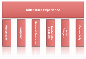
As a refresher, here’s how I wrap my head around user experience: User Experience is composed of six themes: Presentation, Navigation, Relevant Scenarios, Trustworthy Feedback, Initial Bring-up, and Connectivity.

Killer User Experience Themes

Each theme acts like a door. Each door needs to be interesting enough to the user that the user takes a small risk to walk through. The responsibility for the product (and the designer) is that the door through one theme sets the user’s expectations for how the user will experience the next theme.

It’s this failure of handling expectations that made this web site’s user experience horrible. Let’s take a look at how B&H did on each theme:

Presentation: A
B&H’s web site had a great presentation. The home page is easy to look at, has some nice graphics reinforcing what it offers, and I start to build trust that they know what they’re talking about after scrolling down the home page.

Navigation: A
B&H simply helps me navigate to what objects and tasks I want to perform. I searched for iMac, and instantly found it. I also saw “Used” and “Refurbished” and found older ones but decided on a new one (not to mention a nice menu bar at the top showing the kinds of items they sell from video to photo to computer to recording gear…they’re experts at everything!)

Relevant Scenarios: A+
Right next to my iMac was “Add to Cart”, and what makes it an A+ is that instantly after I added it to the cart, I was surprised by being offered free software and discounts on photo editing software I was wanting to buy but didn’t even know they sold.

Trustworthy Feedback: A
I saw my items being added to the cart, saw the total, and I was pumped! I was completely sold not only on the product I was buying but in the way that B&H led me through the transaction with expert reviews, peer reviews, and fast performing “Added to Cart” response.

Initial Bring-up: B+
I had no problems getting started with the web site, but there was a small point of confusion where it didn’t remember my ID so I couldn’t get to my ‘wish list’ as simply as I expected. No biggie. In the end I was led through.

Connectivity: A … then F
I moved between devices and since it offered a user account, I could connect from anywhere and the web site offered instant chat and other features I could have tried.

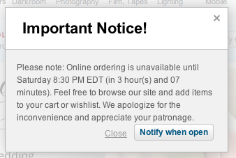
…and then it told me it couldn’t connect to the check-out process.

Now I actually think this is on purpose, but I can’t think of why. They might as well offer a “Buy from Amazon Instead” button on the dialog above.

I did envision one possibility: I imagine a dimly lit basement in the B&H warehouse downtown New York. A young, but strong intern stands in the basement of B&H with sweat rolling off his back as he turns a heavy crank. His muscles are sore, covered in grime, and quivering in exhaustion. Next to him is a two-story rusty mechanism with 12′ gears slowly turning while creaking and complaining at each crank. Above is a sign that reads, “Turn To Activate Your Internet Checkout Subroutine”, and since he’s the only guy strong enough to turn the mechanism, he needs a few hours each Saturday to rest.

Other than that possibility, I just don’t get it.

This experience does strongly validate the importance of the WHOLE user experience. Companies can invest a ton of money in how a product looks, navigates, that it is relevant to the user, gives feedback, and is simple to get started. However, if the back-end fails at the most crucial point, if the whole reason for the web site’s existence is off-line, everything ounce of investment was a waste of money and the whole user experience is a failure.

Even worse, it lost a customer (at least for that day).

I think that’s why I called it a horrible user experience.

How about you? What do you think the most important part of a user experience is?

4 User Experience Insights I Learned From Training My Puppy

A few months ago I got the family our first puppy. Her name? “Orchid Jane Isabella the Rut Killer”…or Orchid for short.

Like any new project, I’ve immersed myself in learning how to train her so she can be the best dog she can be. Along the way, I’ve learned a lot about our pup, my kids, myself…

…and a lot about how we should treat our users for a great user experience!

1) Positive Reinforcement Gets Better Results
I’ve tried different methods of training including one that’s strictly positive with treats/praise, and one with ‘corrections’, or leash pops, etc. In my experience, while I get pup to do what I want in both cases, I get much better results with positive reinforcement. She seems more eager to please as I guide her to do the right thing and reward her for succeeding. Besides, it seems to me that she becomes much more loyal…because she is choosing to engage with me.

A great user experience does the same. Most times users have choices between our software and a competitors. If users get positive feedback, if they’re guided to success, they become happy, engaged, eager to use the software, and they’ll enjoy the experience much more…and in the end our users will be much more loyal.

2) Take Small Steps And Start With The Basics
I am learning that in order to teach a dog a complex trick, it takes many small steps…and you can’t rush it! For example, my pup can now fetch a toy and if I say “Put Away” she walks to the toy basket and drops it in there. It’s awesome to see. However, that was not something I could teach in one step. She is eager to learn but she needs me to break down a trick into a number of basic steps that she can master…and once she masters each step I can have her perform the whole sequence. Further, if I push her too fast or start with the complex multi-step trick, she would get frustrated, abandon the training session, and just sit in a corner and chew on her bone.

A great user experience is the same: Users need to be shown the basics and feel successful! Once they get a handle of core tasks, they can be guided step-by-step through a more complex task, and eventually do the task on their own. If we don’t provide them with that guidance…and ability to do just the basics first, they’ll get frustrated and abandon our product.

3) Be 100% Consistent
To train a pup, I need to be consistent in reinforcing a behavior. If I’m 100% consistent, she learns the verbal or hand command and is very quick to understand what to do.

A great user experience is the same: If we are 100% consistent in our visual metaphors, navigation path, detailed interaction, our users are quick to understand how to get the most out of our products.

4) It’s All About Trust
It took a while for my pup to trust me. As our training proceeded, she learned I wanted the best for her, that I was here to help her succeed, and yes, that I had treats. It turns out that the more my pup trusts me, the more successful our training will be.

A great user experience is the same: As our users first start out with our product, we need to earn their trust…that we are always accurate, have their best interest in mind, and it doesn’t hurt to have some surprises (some cool capability, automation or innovative and elegant experience). The more our users trust us, the deeper into the product they’ll go and integrate it into their business.

~~~~~~~~~~~~~~

How about you, have you found insight into user experience from dog training or other non-technology sources?

Usable vs. Useful: It’s All About Being Relevant

The Great Interweb is filled with sites about designing a product that is usable as well as sites about designing a product that is useful. If you google “usable vs. useful” you’ll even find a lot of great conversation debating the two, but I’ve never really internalized the difference.

My personal moment of clarity came with I picked up my wife’s iPhone.

With its familiar interface, fluid navigation, and multi-touch gestures, I can tell you right now that her iPhone was instantly usable. But after just a few minutes of frustration, I can also tell you right now that her iPhone was completely useless!

…for me.

Using her phone I couldn’t get to my email, my personal calendar, and and I couldn’t even tune my guitar with my favorite guitar tuner app!

That experience was a very eye-opening for me and made me realize that regardless of how shiny the presentation is, and how easy the navigation of a product is, if it is not relevant to me personally, the product is not worth my time.

That made me think: Is it more important to be useful than usable? Can you have one without the other? Also, why do I love products that are not shiny? Craigslist, for example…or my Library app? Neither are examples of awesome visual design, but they are so relevant for me I don’t really care.

That led me to think a bit deeper: Is it an individual personality/generational/character thing that determines which user experience characteristic is most important to a user? If a person is more concerned with the kind of car they drive or other external appearances, does that affect their opinion of a products outward appearance regardless of how useful it is?

How about you? What is most critical for you to have a great user experience?

Related Posts Plugin for WordPress, Blogger...