We Could All Learn From Coffee

I just got an email from Caribou Coffee, and unless it starts with BO and ends with GO, I usually quickly delete them. However, something about the “Uncover our Journey” title intrigued me, so I clicked (full disclosure: I’ve love Caribou Coffee ever since my first napkin had the saying, “Rich and Smooth…because Burnt and Bitter was already taken”).

I opened the email, and clicked on the link…

You can click, too: https://www.cariboucoffee.com/caribou-clean-drink/

What I discovered was an amazing way to communicate integrity, passion, character, deep technical detail, and the ability to execute on a vision through thoughtful design.

I think we could all learn from this (especially those of us in technology).

Transparency
At first glance it looks like a play on words…”see through label?” but right away the site shows its transparency: “Oh, they’re going “open kimono” to show they are proud of their journey and want to share every detail (even the imperfections)

Detail in Design
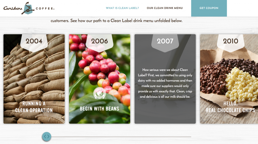
Maybe I’m reading too much into it, but as you scroll to “Our Clean Label Journey”, I noticed three things:

  1. Mouse-over detail: behind the cute marketing message because they know it takes more than shallow words to convince a skeptic…and at this point in the world, I think we are all skeptics of anything
  2. Scroll-Right is optional: They offer details with a scroll-right (or swipe left) to learn every step of their journey
  3. The Scroll Bar Reflects Reality…that Their journey is NOT DONE: I love this part. The design shows a scrollbar … nice big fat scrollbar…and look what happens as you scroll right…it stops before the rail ends. Subtly they are showing that the journey isn’t done yet.

Off-Limits
As you  continue scrolling, you see the “Off-Limits” list where they again have cute slogans with fairly meaty details available for those that mouse over the content

No Guess-Work
This was another favorite: “Guess What Might Be Added  To Other Coffee” section let the user simply scroll and as a whimsical surprise, a very large technical list of ingredients appears on the right. Now, they could have added it in the main space, but how boring!

This was pure design delight. I could see the technical details, and even chuckled when commentary flowed in the list AND the bottom of the page “Almost there…” and so on.

Finally when the list is done, some very subtle yet effective animation throws the “Other” cup aside, and makes the Caribou cup glisten…like it won…but also like it sparkles with purity.

No Detail is Too Detailed
In the menu section there’s a lot of pretty pictures with big words for the main ingredients. Only the most nerdy would scroll through the end of each ingredient list. If you do, then you’re like me and you’ll be further delighted with a “Detailed Ingredients” list that shows every last detail…and then a Culinary Team Note clarifying that even complicated sounding ingredients can be natural.

Finally, there’s a FAQ section that further shows honesty where they list exactly the drinks that are not Clean Label…and what ingredients aren’t, and a nice section on “This sounds complicated…how can it be natural?”

Well done, Caribou. I love the design…and the honesty. Shows you are a great company that cares about its users.

Kinda Like Finding Dog Hairs In your Cupcake

When we designers at IBM start communicating ideas for a new design, one powerful way is through an analogy. It’s a way to relate a powerful capability and user value of complex enterprise software by associating it with something that everybody 10 years or older can understand.

“Our cloud?…it’s kinda like Disney World for your workloads”

But sometimes analogies are great to communicate how crappy software can be. Like this…

“Bad messages in your software is kinda like finding dog hairs in your cupcake.”

Mmmm…yummy…and thoughtful.

Cupcakes are delicious, beautiful, and everybody likes them. We want our software to be the same! The problem is that your software could be the most functionally rich, best designed, and beautiful UI in the world…but if bad messages appear, it wrecks the whole experience…frustrates your users, and sometimes makes them angry enough to make your users abandon your product.

It just happened to me.

Recently I watched my son register to automatically submit his transcripts to the university he was applying to. Great! Very useful! Love it!

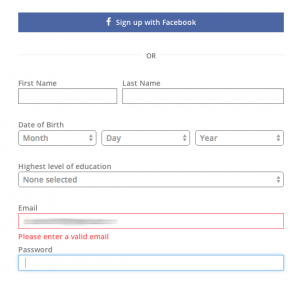
When he signed up, here’s the message he got:

badmessage

We tried other emails and it worked fine. We copy/pasted and all the other tricks (thinking it had hidden characters somewhere) but no luck. Finally, beyond frustration, we just gave up and contacted the guidance counselor the next day.

Days later, we learned that the email was not valid for registration because his school had ALREADY REGISTERED HIM!

While it’s technically accurate that the email is not valid during registration because the email was already registered, it’s a stupid message! It caused us endless grief and prompted us to use the ‘old fashioned’ way and abandon the software.

In the end, a user experience is only as delightful as its weakest message. Designing for error paths and writing great messages is boring. I get that. Most of us leave it to the end. But if we DO focus on messages just as much as the colors and fonts of a product, it could have a far deeper impact for our users.

How about you? Have you been delighted by a products messages? Or did you eat dog hair, too?

“Delightful” Doesn’t Have To Mean Simple

At our last design summit at IBM Design, we worked through some pretty great ideas, including how to delight our target user, Maureen, who we defined as an experienced developer who lives and breathes “DevOps”…she needs a much better experience than the one she has now. During one of the “User Empathy” sessions, we were trying to define what would delight her…what would “wow” her…what would make her jaw drop and wonder out loud how she ever got work done without it. We spent quite a while discussing how to simplify her experience and make things more automated…

…when a colleague quipped:

“A ‘wow’ for a craftsman is not a button that “with one click” creates a table. A ‘wow’ is common tools, common grips, common chargers, that enable him to fluidly use his skills and express his creativity”

We all stopped talking.

Yes. Yes. Yes. Yes. Yes. Yes.

We can’t assume that a delightful experience equals a guided “let me help you” approach.

That’s exactly why I use Logic Pro as opposed to Garage Band. I want to express my creativity using my skills to the best of my ability…not press “Create” and have a fake song appear.

Thank you, Johnathan, for this infinitely valuable reminder.

Related Posts Plugin for WordPress, Blogger...