“You Forgot Your WHAT!?!” – Business Trip Adventures

If I were to author a piece of fiction in the “Business Travel Adventures” genre, I still wouldn’t have “thickened the plot” with everything that I experienced in my last trip since the story would become “Fantastical Fantasy” genre… it would have seemed fake. 

But, it happened, and I needed to document this … who knows, it may become a pilot for a new reality show called “urban survivor”! 


On Monday, I was asked, last minute, to present, in person, to a client in NYC on Thursday. No problem. I’ve done this hundreds of times, even with short notice and I know my stuff. However, since this was only my second trip post Shutdown, I went through my travel list to mentally focus on everything I needed.

Laptop? check.  Toothbrush? check.   nice jeans/shirt? Check.  Hotel/Air/Presentation content?  Check. All set!

Wednesday morning, I was prepared. Then, I was asked to alter the presentation (slides and narrative), and that required additional time to prepare, but … no problem. The flight left at 3pm, and I had a client call at 1:30-2 so I drove up early to get all settled in a nice quiet corner of the airport so I could take that client call, with plenty of time spare to prepare to adjust my presentation.

I arrive at 12:40 with PLENTY of time…I drive to long-term parking …

…and my heart stopped. No.  screamed. Screamed as it fell 5000 feet into a dark, echoy chamber.

…I forgot my wallet. 

Sheer panic.

The ONE thing I NEVER forget! The ONE thing I tell my kids “don’t forget your wallet!” “You see kids, as long as you have your wallet you can solve most any troubling situation”.

Dammit!

I pulled into the “Arrival” curb just so I could think. I couldn’t think! I called my wife to talk it through. What could I do? I had no credit cards, no driver license, no cash, no vaccine card, nothing! We talked about her driving 1/2 way up and meeting me. No, I had that important client call. I couldn’t drive while presenting, and not enough time to get back.

Dammit! 

Think…think…think.

OK. Break down the problem. Can I do this without a wallet?

OK. Think…

OK, First, can you park? Yes, I can take a ticket to pay later. I have NO idea how to pay later, but that’s 3 days from now. Let’s worry about that in 2.5 days.

OK.  Second, what about the flight. Can you get through security?

…Think…and search…

AH! YES!  I still had my passport buried in my work backpack from January 2020 flight to Barcelona. I can use that to get through security.

OK. What about getting from LaGuardia to hotel? 

…Think…

My Phone!  I have Uber active and my corporate card attached. No credit card needed to drive.  In fact, I can Uber to the meeting and back to airport so I’m all good there.

OK. how about the Hotel? They require to see credit card in order to register.

Virtual Check-in!  My Hilton app lets me check in, get a digital key, and never even approach the hotel counter! 

Cool. Now you can fly there, transport, and get to hotel. You’re mostly there.

How will you eat?

…think…

ApplePay!  I’ve got my debit and Apple card set up so I just need to find a place that accepts ApplePay, or just eat the hotel and have it bill the room.

OK!  What about cash for paying for parking?  Not sure yet, let’s worry about that later.

SO… I parked, got through security, boarded the plane, hailed an Uber, got to hotel, and all was well!!!

Until…

I open the in-person invite that I was finally sent for the meeting in 9 hours.  “Dress code: Business Formal”.

Dammit! 

I packed my normal “look nice in a shirt and dark jeans”, but nothing close to business formal. I don’t even own a sport coat. But this new gig involves a lot of financial services companies. What should I do?

I SHOULD BUY A SPORT COAT!

Quick, call the wife to find out who in NYC sells sport coats AND accepts Apple Pay! (why call the wife? Because I’m not thinking clearly, I needed someone on this quest to think clearly and it clearly wasn’t me!)

Wife’s Answer? Macy’s!!!   …just added in July 2021. God Bless their Digital Transformation that I discussed with them back in 2015!

I changed into the shirt I planned to wear for the meeting, hiked over to Macy’s, and 45 minutes later, after debating about subtle colors, befriending a man who helped size me up, (I’m a 38R, who knew) I walked out with a decent sport coat that didn’t cost a crazy amount (but forever will be labeled as “I bought this from a boutique dealer in New York’s Fashion District!”)

OK. Now for a nice dinner so i can regain my focus! (but no drinks…gotta stay sharp, and i’m not thinking clearly already)

“No, we don’t”, is all I heard from hosts regarding “Do you take ApplePay?”. After a long search, I finally found Chipotle, who DID accept ApplePay, and I had a “to-go” meal (because I needed proof of vaccine to eat in the store) so I hiked back to the hotel. 

While eating, I loaded my phone with photos my wife sent of my Vaccine card, ID, and AmEx card. This turned out to be very useful, since only NY residents have access to the ‘official’ vaccine app, but I now have a password-protected Apple Note with Vax card and photo ID next to each other. It is the easiest way to prove I can sit and eat at a restaurant in NYC. Also while I was eating, we had a last-minute internal meeting where I was asked to change content for the presentation.

Next day, I Uber’d to the site, had a meeting I’ll never forget (not in a good way…but a topic for another blog), but did end the evening with a rich conversation with the client, as well as a fantastic steak meal, (with two decaf-espresso martini’s), and a long walk from 1st to 28th back to hotel.

Last quest? Find cash so I can pay for parking after I fly home tomorrow. Surely in a 35 minute walk through NYC I can find a way to get cash? Who should I call?

My wife!!   She says many ATMs take ApplePay via Debit Cards.  

OK! I have a debit card in my ApplePay! I try the first 5 ATM machines…

…Nothing. Debit only works for “bank owned” debit cards. Back to the wife. “I have a Wells Fargo debit you can use, and you can manually enter into ApplePay”.  I try, and it WORKS!

…except not at the Wells Fargo ATM  “Sorry, our systems are temporarily down”.

Dammit!!

How about this local drug store? “Do you give cash back?”. Response, “Only $10. How much you need?”, “About $80-100”.  “Um, No.”

OK.  Try more ATMs. Nothing.  I try to walk up to my Hotel front desk, “I lost my wallet…can you provide a cash advance from my card on file?”  “No.”

Dammit!

OK. …Think…  Ooooo! There’s a Rite Aid!  “Say, do you offer cash back with purchases?”,  “yes, but only $40”.  “OH!, can I buy 2 things to get to $80?”.  “Sure?”

And here I present to you two tins of ALTOIDS, which cost $43.25 EACH. (forever to be known as “The ALTOIDS maneuver”
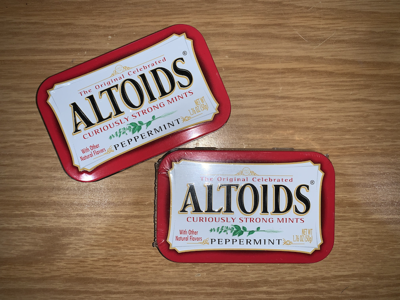
But now, I have enough cash for exiting parking!!! …I think. I mean parking costs $22 per day. I couldn’t get the “use your credit card discount” option, and if they charge full days on partial usage, could I be charged more than $80? Don’t know. Don’t care anymore. I’m going home. If I get stuck, one of my two daughters who live in the Cities can bail me out.

I get back to the hotel, pack, Uber to airport, use my passport to get through security, buy lunch with ApplePay, fly home, get in the car, pull up to “Cash Only”, and…

…”that will be $58.00 please”

YES!

“Just curious, do you take Apple Pay?”

“No.”


I’m actually quite amazed at the success of this journey. But to be fully transparent, the toll it took on my “stay sharp and fully prepare for the client meeting” way-of-working was one reason the presentation was such a disaster (at least for me).  The other reasons? It’s not important.  I knew the constraints I was given, and I knew what it would take to prepare. What I didn’t plan on was how a simple brain blink (forgetting my wallet) could result in washing away all prep time (and adding cognitive poison to my usually sharp brain). Sure, I would have been a true “Rock Star” if I had pulled off a great client session given all this, but I wasn’t…at least this time. 

Is there a lesson for me? Many. I could fill up an entire chapter. For now I’ll summarize with this:

Think.  Prepare.  Practice.

Depend on Others.  Trust your Story. 

Risk is OK.  Failure will Happen.  

Trust your Skills.  Always Learn.  

Get Up! 

Isn’t “Horrible UX” A Bit Harsh?

Last time I wrote about my experience at B&H web site and how the “Horrible” user experience eventually saved me $500 and cost B&H $2000.

I wanted to dig in a bit to why I used “Horrible”. After all, a LOT of what I experienced was actually pretty great! It all comes down to how B&H violated the six themes of user experience, and the expectations they set up through those user experiences all with one simple message:

bhoffline

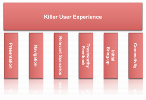
As a refresher, here’s how I wrap my head around user experience: User Experience is composed of six themes: Presentation, Navigation, Relevant Scenarios, Trustworthy Feedback, Initial Bring-up, and Connectivity.

Killer User Experience Themes

Each theme acts like a door. Each door needs to be interesting enough to the user that the user takes a small risk to walk through. The responsibility for the product (and the designer) is that the door through one theme sets the user’s expectations for how the user will experience the next theme.

It’s this failure of handling expectations that made this web site’s user experience horrible. Let’s take a look at how B&H did on each theme:

Presentation: A
B&H’s web site had a great presentation. The home page is easy to look at, has some nice graphics reinforcing what it offers, and I start to build trust that they know what they’re talking about after scrolling down the home page.

Navigation: A
B&H simply helps me navigate to what objects and tasks I want to perform. I searched for iMac, and instantly found it. I also saw “Used” and “Refurbished” and found older ones but decided on a new one (not to mention a nice menu bar at the top showing the kinds of items they sell from video to photo to computer to recording gear…they’re experts at everything!)

Relevant Scenarios: A+
Right next to my iMac was “Add to Cart”, and what makes it an A+ is that instantly after I added it to the cart, I was surprised by being offered free software and discounts on photo editing software I was wanting to buy but didn’t even know they sold.

Trustworthy Feedback: A
I saw my items being added to the cart, saw the total, and I was pumped! I was completely sold not only on the product I was buying but in the way that B&H led me through the transaction with expert reviews, peer reviews, and fast performing “Added to Cart” response.

Initial Bring-up: B+
I had no problems getting started with the web site, but there was a small point of confusion where it didn’t remember my ID so I couldn’t get to my ‘wish list’ as simply as I expected. No biggie. In the end I was led through.

Connectivity: A … then F
I moved between devices and since it offered a user account, I could connect from anywhere and the web site offered instant chat and other features I could have tried.

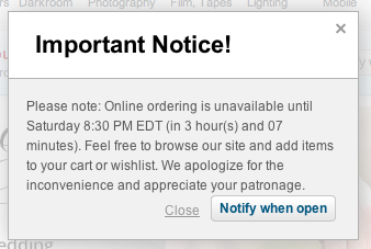
…and then it told me it couldn’t connect to the check-out process.

Now I actually think this is on purpose, but I can’t think of why. They might as well offer a “Buy from Amazon Instead” button on the dialog above.

I did envision one possibility: I imagine a dimly lit basement in the B&H warehouse downtown New York. A young, but strong intern stands in the basement of B&H with sweat rolling off his back as he turns a heavy crank. His muscles are sore, covered in grime, and quivering in exhaustion. Next to him is a two-story rusty mechanism with 12′ gears slowly turning while creaking and complaining at each crank. Above is a sign that reads, “Turn To Activate Your Internet Checkout Subroutine”, and since he’s the only guy strong enough to turn the mechanism, he needs a few hours each Saturday to rest.

Other than that possibility, I just don’t get it.

This experience does strongly validate the importance of the WHOLE user experience. Companies can invest a ton of money in how a product looks, navigates, that it is relevant to the user, gives feedback, and is simple to get started. However, if the back-end fails at the most crucial point, if the whole reason for the web site’s existence is off-line, everything ounce of investment was a waste of money and the whole user experience is a failure.

Even worse, it lost a customer (at least for that day).

I think that’s why I called it a horrible user experience.

How about you? What do you think the most important part of a user experience is?

Worst Intro EVER – How NOT To Communicate Your Message

I was just in Las Vegas speaking at a trade show. I peeked into a 300 seat room the day before my session and heard:

“I really don’t like these after-lunch time slots…I like mornings when I have a captive audience”

Seriously?

That was his opening line! In one swift statement, this speaker communicated to the 75+ in the audience:

“I don’t want to be here”
He obviously wanted to speak in a morning session. Stupid. If the audience is sitting in front of you, you have a rare opportunity to communicate your message to those specific humans. Who knows where each of these human connections will lead…other contacts, more sales, a better understanding of your product, even unique feedback on your product’s user experience. There are a thousand ways to blow a speaking session, but this is the most dumb.

“I don’t want you here”
He insulted his audience by assuming they would be inattentive. It’s like he said, “All of you in this audience are not who I had in mind. Even though you chose his topic over the 5 other concurrent topics, you are bound to be inattentive. After all, the success of this session is really up to you, the audience. If only you people were different, you would make the session more compelling”. Stupid speaker.

“I’m not really that good”
On the surface it sounds like he’s so proud of his message that he doesn’t want to ‘waste’ it on the 78 people in the audience. I think he’s just not that good: To lay blame on a lame session…before it even starts…on the audience, the time slot, the lunch, tells me he’s accepted a disastrous outcome and does not want to be responsible for its failure. Heaven forbid he work on his delivery, add some passion, and communicate concepts clearly so it’s interesting to the audience … even during an after-lunch session.

~~~~~~~~~~~~~~

If I’ve learned anything from my 18 years of speaking about technology is that whether you have 1 or 1,501 in attendance (I’ve had both), they are there because they want to learn what you know…they already chose you over many other options (including exploring the host city). It’s your responsibility to focus, deliver with passion, use stories and personal experience to make it interesting…and make them thrilled they spent that hour with you because it might just change how they run their business.

How about you? What is the worst speaker intro you’ve ever heard?


Usable vs. Useful: It’s All About Being Relevant

The Great Interweb is filled with sites about designing a product that is usable as well as sites about designing a product that is useful. If you google “usable vs. useful” you’ll even find a lot of great conversation debating the two, but I’ve never really internalized the difference.

My personal moment of clarity came with I picked up my wife’s iPhone.

With its familiar interface, fluid navigation, and multi-touch gestures, I can tell you right now that her iPhone was instantly usable. But after just a few minutes of frustration, I can also tell you right now that her iPhone was completely useless!

…for me.

Using her phone I couldn’t get to my email, my personal calendar, and and I couldn’t even tune my guitar with my favorite guitar tuner app!

That experience was a very eye-opening for me and made me realize that regardless of how shiny the presentation is, and how easy the navigation of a product is, if it is not relevant to me personally, the product is not worth my time.

That made me think: Is it more important to be useful than usable? Can you have one without the other? Also, why do I love products that are not shiny? Craigslist, for example…or my Library app? Neither are examples of awesome visual design, but they are so relevant for me I don’t really care.

That led me to think a bit deeper: Is it an individual personality/generational/character thing that determines which user experience characteristic is most important to a user? If a person is more concerned with the kind of car they drive or other external appearances, does that affect their opinion of a products outward appearance regardless of how useful it is?

How about you? What is most critical for you to have a great user experience?

User Experience – Communicating A Core Principle

In a recent talk I gave, I described our overall mission for Flex System Manager as, “To provide a best-of-breed experience in managing physical/virtual resources across compute, storage, network so that business-critical workloads can thrive.”  I also described that, in order to achieve that mission, we defined a number of core principles that we drive to and measure against.

I had just finished showing off our new mobile app and enhanced UI in our new Flex System Manager release, and it was clear from the audience applause that we are delivering some really great enhancements that looks pretty darn cool.

I then got to our core principle, “Enhanced User Experience”.

To help the audience fully understand what we mean by user experience, here’s what I said:

“User experience is far more than shiny objects and cute iPhone apps. To us, it’s also about reducing the time to set up the whole PureFlex environment and manage it…it’s about providing automation users can trust so that when they press a button, they trust our software to relocate and optimize their production-level workloads…it’s about providing relevant actions and showing relevant data to help users trouble-shoot and make the decisions they need to manage their data center”

Yes, ‘shiny’ is important, but ‘fast’, ‘trustworthy’, ‘relevant’…that’s what makes a great, and lasting, user experience.

How about you, how do you communicate what user experience means to you?


Related Posts Plugin for WordPress, Blogger...