Nothing Lasts – Except …

This link really screwed me up…

https://kruemcke.wordpress.com/2015/09/29/auld-lang-syne-ibm-systems-director-aix-6-withdrawn/ 

It was the announcement that IBM Systems Director, the product I spent years working on, was officially being pulled from market.

From 2004 through 2012 I spent most of my time at work working with users, designing, leading, educating, writing, and traveling to make IBM Systems Director the best it could be.

…and now it’s gone.

Not that it shouldn’t be…it’s a product from another era…pre-cloud. It’s purpose was to provide IT administrators a single experience that could manage the whole data center in a company’s shop. Certainly we can talk for hours about to what degree it succeeded doing that. While some may have criticized it, I loved working with a fantastic development team, and I felt like through our work with users and focusing on what they need, we were able to raise it a whole grade (or two) compared to what it could have been.

But, in the end, customers, and IBM, moved on.

What really messed me up is trying to think of all the personal and family sacrifice I made to make it better, not to mention the hit to the ego. I started to think of the missed family activities, all the effort, all the “we’ll fix it next release”, and it hit home that nothing…especially nothing in the IT world…lasts.

Which makes me think: what will last?  In a big company like IBM, even the best employee leaves a hole that fills in within a week or two. It reminds me of a Diary Queen shake: A new employee is like taking a spoonful out of a melty shake…the melty ice-cream quickly folds in and within minutes, nobody knows the spoon was even in there.  Even a stellar employee is like a spoon getting pulled out of a thick custard shake…it may take a bit longer but soon enough even the biggest hole gets filled in. Actually, a healthy company is designed to do that so productivity isn’t impacted by one person.

So where does that leave me?

When I boil it down, most things I just lift right out: Church, worship band, work, hobbies…

So what’s left? Relationships. My relationships to my family and friends. Most of my work relationships won’t last…hopefully some will but most are merely acquaintances (who will hopefully one day pause a few minutes before claiming my chair, monitor, and white-board markers). My family relationships are what might last: My wife, my kids. My wife I love dearly, and we are each-other’s anchor. But really the only thing that I am uniquely essential to is my kids. Sure someone else can raise them, but they won’t be their dad. That’s all me.

So what do I do with that? In a way it’s invigorating! It helps me focus on what’s actually important.

…to raise these kids the best I know how…

…to show them what hard work looks like
…that sometimes responsibility DOES mean sacrifice
…that a career is the HOW to provide and have a fantastic life, but not the WHY
…that life doesn’t revolve around them, but in how they can serve others
…that they should be driven by their passions and a career can possibly become that passion but will more likely their passion will become a wonderful side-car to their career that will give their life a sparkle.
…that they don’t forget what is most precious…it’s the WHO’s in your life, not the WHATs

Anyway, I’m still learning and trying to balance how this all works. Maybe I can teach and guide them so it doesn’t take them 23 years of hard work, where 8 of those years were entirely focused on a product that is no longer in the market…just to realize that the product’s purpose for me was to enable a fantastic life…it’s not the source of a fantastic life.

Understanding the COMPLETE End-To-End User Experience

We in the tech industry talk a lot about ‘information integrity’, and ‘data security’, and how the world can use information to better their company…so keep it safe!

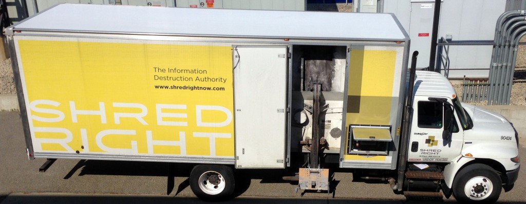
While true, I loved seeing this photo as a reminder that everything we create has a life-span. Nothing we create will last forever: Our products, our designs, and even the information we generate along the way.

IMG_8335

And while most of us focus on offering solutions on how customers can securely analyze their precious data, this business found a way to be honest: Someday that precious data will not be useful; that destroying data is a natural part of the end-to-end experience.

I wonder how much more delighted we would make our customers if we guide them not only how to discover, try, and buy our products, but also on how to repair, upgrade, and eventually discard our products?

If we face ‘the end’ as a natural part of the full user experience, will we cherish our users more, and not take for granted how precious it is that humans are actually trying to use something we created to be more productive

Maybe if we do, ‘the end’ won’t arrive for quite a long time.

Isn’t “Horrible UX” A Bit Harsh?

Last time I wrote about my experience at B&H web site and how the “Horrible” user experience eventually saved me $500 and cost B&H $2000.

I wanted to dig in a bit to why I used “Horrible”. After all, a LOT of what I experienced was actually pretty great! It all comes down to how B&H violated the six themes of user experience, and the expectations they set up through those user experiences all with one simple message:

bhoffline

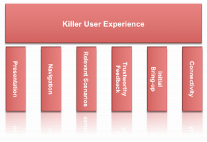
As a refresher, here’s how I wrap my head around user experience: User Experience is composed of six themes: Presentation, Navigation, Relevant Scenarios, Trustworthy Feedback, Initial Bring-up, and Connectivity.

Killer User Experience Themes

Each theme acts like a door. Each door needs to be interesting enough to the user that the user takes a small risk to walk through. The responsibility for the product (and the designer) is that the door through one theme sets the user’s expectations for how the user will experience the next theme.

It’s this failure of handling expectations that made this web site’s user experience horrible. Let’s take a look at how B&H did on each theme:

Presentation: A
B&H’s web site had a great presentation. The home page is easy to look at, has some nice graphics reinforcing what it offers, and I start to build trust that they know what they’re talking about after scrolling down the home page.

Navigation: A
B&H simply helps me navigate to what objects and tasks I want to perform. I searched for iMac, and instantly found it. I also saw “Used” and “Refurbished” and found older ones but decided on a new one (not to mention a nice menu bar at the top showing the kinds of items they sell from video to photo to computer to recording gear…they’re experts at everything!)

Relevant Scenarios: A+
Right next to my iMac was “Add to Cart”, and what makes it an A+ is that instantly after I added it to the cart, I was surprised by being offered free software and discounts on photo editing software I was wanting to buy but didn’t even know they sold.

Trustworthy Feedback: A
I saw my items being added to the cart, saw the total, and I was pumped! I was completely sold not only on the product I was buying but in the way that B&H led me through the transaction with expert reviews, peer reviews, and fast performing “Added to Cart” response.

Initial Bring-up: B+
I had no problems getting started with the web site, but there was a small point of confusion where it didn’t remember my ID so I couldn’t get to my ‘wish list’ as simply as I expected. No biggie. In the end I was led through.

Connectivity: A … then F
I moved between devices and since it offered a user account, I could connect from anywhere and the web site offered instant chat and other features I could have tried.

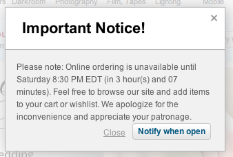
…and then it told me it couldn’t connect to the check-out process.

Now I actually think this is on purpose, but I can’t think of why. They might as well offer a “Buy from Amazon Instead” button on the dialog above.

I did envision one possibility: I imagine a dimly lit basement in the B&H warehouse downtown New York. A young, but strong intern stands in the basement of B&H with sweat rolling off his back as he turns a heavy crank. His muscles are sore, covered in grime, and quivering in exhaustion. Next to him is a two-story rusty mechanism with 12′ gears slowly turning while creaking and complaining at each crank. Above is a sign that reads, “Turn To Activate Your Internet Checkout Subroutine”, and since he’s the only guy strong enough to turn the mechanism, he needs a few hours each Saturday to rest.

Other than that possibility, I just don’t get it.

This experience does strongly validate the importance of the WHOLE user experience. Companies can invest a ton of money in how a product looks, navigates, that it is relevant to the user, gives feedback, and is simple to get started. However, if the back-end fails at the most crucial point, if the whole reason for the web site’s existence is off-line, everything ounce of investment was a waste of money and the whole user experience is a failure.

Even worse, it lost a customer (at least for that day).

I think that’s why I called it a horrible user experience.

How about you? What do you think the most important part of a user experience is?

3 Steps To Get Started In Social Media

Recently I was asked, “What does it take to get started in Social Media as a corporate employee?”. Here’s my response…

~~~~~~~~~~~

That’s easy: It will take 10 minutes per month — from 12:50-1:00 p.m. central time — on the third Thursday, to be successful in social media.

OK so it’s not quite that simple. The real answer is that it takes three steps:

  1. Define Your Goal
  2. Have Balance
  3. Be Consistent

Define Your Goal
Before you start anything in social media, you need to define your goals. Once you have a clear picture of why you want to engage in social media, you need to be honest about how much time that would require.

For example, if your goal is to help an occasional user, you could, in fact, spend only 10 minutes per month reading your go-to forum and responding to individual questions about a topic you know about. However, if your goal is to be known in the industry as an expert, you could spend an hour per week creating your own technical blog to provide others in the industry tips and insight based on your experiences.

Have Balance
It really is up to you how frequently you are involved with social media, but make sure you can balance your social media effort with what you’re currently doing in your work.

Here are some example guidelines I have used to keep balanced while working towards my goal:

  • Blog: Post at least once per month. The more frequent, the shorter the posts can be. I find 300-500 words is ideal as users want to gain insight but not spend a lot of time reading
  • Tweet: Tweet at least once per week. Followers want regular insight. Think about making it a ‘tip of the week’.
  • YouTube: Post an educational/demo video once every 2 months. Make them short, and have them cover only one key topic.
  • Online in-depth article: Once per quarter since these are generally much longer and have a wider distribution.

Tip: When you feel like writing, work ahead! You will feel much better if you have a collection of blogs/tweets/videos that are publish-ready and can be scheduled using many available tools, rather than scrambling to meet the next deadline.

Be Consistent
The reality is that to be engaged in social media, you need to be consistent with how often you interact. Nothing is more useless than a stale blog or channel. If you think it might be ‘too much’, get a small team together to share the responsibilities. That way the frequency for you can be less but your followers still get the consistent cadence.

Regarding duration: Social media is an ongoing interaction. If you stop, your digital presence will fade. As long as your frequency is consistent, your social presence will stay, but there really is no ‘end date’. If your followers do not see regular updates, they will stop looking for your content. In my experience, if your goal is to help your customers gain insight into a product or service, make the blog/handle reflect the product name so if you move on to another job, someone else can take over the social media outlet and your customers can still gain insight from a new expert.

Finally, don’t forget to interact with your customers through comments. I often create content, but then forget that the real value of social media is in the conversation that happens between you and your subscribers in the comments section. This will not only keep things personal, it will grow your social media presence.

Question: How do you approach social media?

Usable vs. Useful: It’s All About Being Relevant

The Great Interweb is filled with sites about designing a product that is usable as well as sites about designing a product that is useful. If you google “usable vs. useful” you’ll even find a lot of great conversation debating the two, but I’ve never really internalized the difference.

My personal moment of clarity came with I picked up my wife’s iPhone.

With its familiar interface, fluid navigation, and multi-touch gestures, I can tell you right now that her iPhone was instantly usable. But after just a few minutes of frustration, I can also tell you right now that her iPhone was completely useless!

…for me.

Using her phone I couldn’t get to my email, my personal calendar, and and I couldn’t even tune my guitar with my favorite guitar tuner app!

That experience was a very eye-opening for me and made me realize that regardless of how shiny the presentation is, and how easy the navigation of a product is, if it is not relevant to me personally, the product is not worth my time.

That made me think: Is it more important to be useful than usable? Can you have one without the other? Also, why do I love products that are not shiny? Craigslist, for example…or my Library app? Neither are examples of awesome visual design, but they are so relevant for me I don’t really care.

That led me to think a bit deeper: Is it an individual personality/generational/character thing that determines which user experience characteristic is most important to a user? If a person is more concerned with the kind of car they drive or other external appearances, does that affect their opinion of a products outward appearance regardless of how useful it is?

How about you? What is most critical for you to have a great user experience?

User Experience – Communicating A Core Principle

In a recent talk I gave, I described our overall mission for Flex System Manager as, “To provide a best-of-breed experience in managing physical/virtual resources across compute, storage, network so that business-critical workloads can thrive.”  I also described that, in order to achieve that mission, we defined a number of core principles that we drive to and measure against.

I had just finished showing off our new mobile app and enhanced UI in our new Flex System Manager release, and it was clear from the audience applause that we are delivering some really great enhancements that looks pretty darn cool.

I then got to our core principle, “Enhanced User Experience”.

To help the audience fully understand what we mean by user experience, here’s what I said:

“User experience is far more than shiny objects and cute iPhone apps. To us, it’s also about reducing the time to set up the whole PureFlex environment and manage it…it’s about providing automation users can trust so that when they press a button, they trust our software to relocate and optimize their production-level workloads…it’s about providing relevant actions and showing relevant data to help users trouble-shoot and make the decisions they need to manage their data center”

Yes, ‘shiny’ is important, but ‘fast’, ‘trustworthy’, ‘relevant’…that’s what makes a great, and lasting, user experience.

How about you, how do you communicate what user experience means to you?


Related Posts Plugin for WordPress, Blogger...