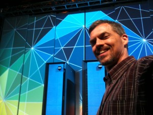
28 Years, Design, Cloud Journeys, Loss, Gain

I mark my 28th anniversary at IBM on Monday, August 31st.

In a very real sense, each of the 28 years have built to this moment…that what I’m doing now is only possible because of everything I’ve learned. 

Let me explain…

While I started out in development, most of my years were spent in design; designing interaction for several products that were born with my pencil, flourished with our team collaborating with users, developers, product owners, and still thrive to this day. In some cases, however, we’ve had to mourn the product’s death.  (a hard lesson that every thing has a season, and especially in tech, and you will outlive most of your grandest achievements).

The peak of the flourishing was when I led two design projects: one for cloud, and one for systems. We used latest design techniques at the time to capture what users needed, paired with what I called the 6 pillars of crafting a killer user experience. Soon after, the IBM Design studio emerged, and we adopted IBM Design Thinking, which uses a variety of techniques to focus the design on measurable outcomes, bringing together diverse teams and form a continual loop of Observe, Reflect, Make.

Then came what I call, “The year of the Troubles”, where my technical depth collided with the design mission of the day.

I mourned, then moved on, deciding to learn about other areas of the company (offering management, sales enablement) and then got the chance to work with the best of IBM in the Hybrid Cloud CTO Office, and now in the Cloud Engagement Hub.

It’s here, in the Cloud Engagement Hub, where every bit of those 28 years comes into daily use; and while I did not plan this out from day one, it seems clear to me that I couldn’t do this work today without having experienced the following in my IBM journey…

…how to test systems and devices that would be used in production

…how to lead that team to scale excellence

…how to develop in enterprise shops where large teams depend on you

…how to design user interfaces used by admins to keep their production systems healthy

…how to lead teams that deliver those user experiences

…how to work across distant teams with different cultures to achieve excellence

…how to communicate with confidence, compassion, and diplomacy both inwardly to teams and externally to clients because there are people that are hard to work with. Always have been and always will be

…how to mourn the loss of what I love doing because my skills, while award-winning, were not from “formal training”

…how to pick myself up and find a new path

…how to enable others to do their best through technical accuracy and “knowing our user”

…how to tell a story…that is accurate, technical, current, and compelling

…how to experiment to become an expert in new things, knowing each learning is hard

…how to deliver during high-pressure situations where a lot is on the line

…how to blend deep understanding of our tech, deep understanding of our clients, and compassion for those I interact with…to create a cloud journey that benefits everyone

Each one of those I use nearly every day.

In the work I do now, helping clients define and execute on their technical cloud journeys, I have the chance to bring everything together…and do what I love most…

Design.

But not UI design, nor even user experience design of a product, nor even leading a design army to deliver a large cloud offering,…

I get to design a specific client’s end-to-end technical cloud journey. I get to bring together ALL that IBM has to offer: Cloud, Services, Software, Systems, world-wide experts, and treat each as a design ingredient…part of the palette …to deliver not just products that will delight them, but a customized multi-year journey that will delight them at all levels: business, innovation, IT, Cloud, revenue, …and on and on.

So while I had to mourn the loss of my design world, it turns out it was essential to break me out of the box that would have kept me in. I’ve rebuilt, reimagined, date I say redesigned what I do to to help others in deeper ways than I could have ever imagined:

I design technical cloud journeys

And using my years of design experience is a big part of why it works:

  • Using design thinking techniques for all on the team to contribute delivers better ideas, better solutions.
  • Using storyboards and as-is journeys and to-be journeys help communicate the vision
  • Using Hills (a key ‘north star’ technique) help keep the team on track, the client interested, and in the world of cloud journeys, has a measurable outcome we can commit to (financially and experientially).
  • Using my intuition, gut instincts, and creativity to craft a technical cloud journey that is uniquely suited for the client.

This is an exciting time!

I have a lot more thoughts around “Cloud Journey Thinking”, so stay tuned for future articles on how I’m working to apply Design Thinking in a much broader sense to deliver technical cloud journeys to clients.

We Could All Learn From Coffee

I just got an email from Caribou Coffee, and unless it starts with BO and ends with GO, I usually quickly delete them. However, something about the “Uncover our Journey” title intrigued me, so I clicked (full disclosure: I’ve love Caribou Coffee ever since my first napkin had the saying, “Rich and Smooth…because Burnt and Bitter was already taken”).

I opened the email, and clicked on the link…

You can click, too: https://www.cariboucoffee.com/caribou-clean-drink/

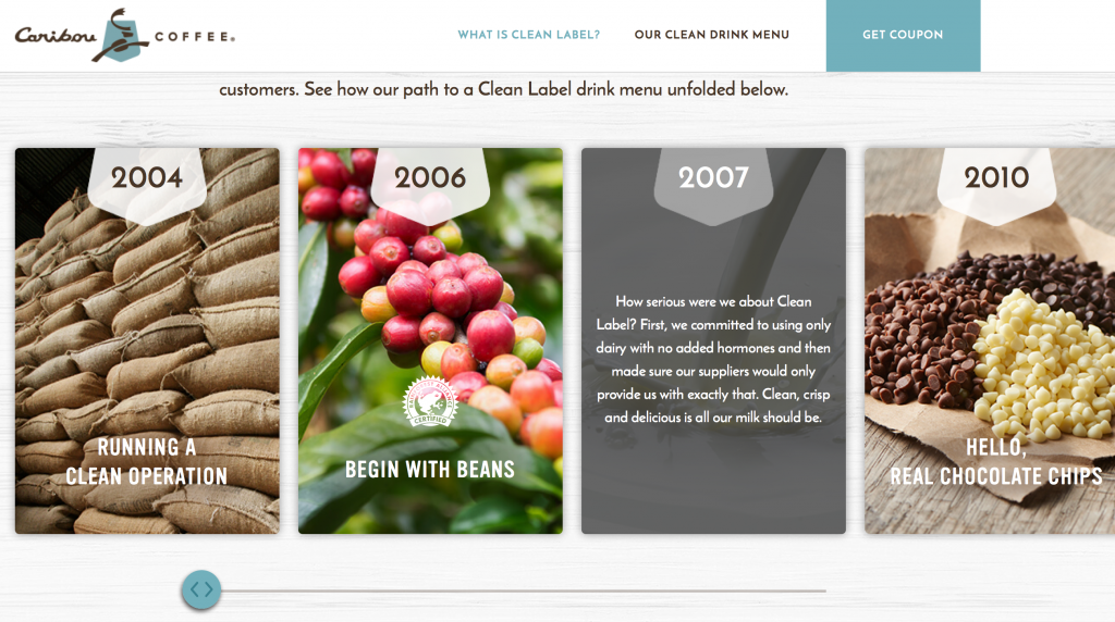
What I discovered was an amazing way to communicate integrity, passion, character, deep technical detail, and the ability to execute on a vision through thoughtful design.

I think we could all learn from this (especially those of us in technology).

Transparency
At first glance it looks like a play on words…”see through label?” but right away the site shows its transparency: “Oh, they’re going “open kimono” to show they are proud of their journey and want to share every detail (even the imperfections)

Detail in Design
Maybe I’m reading too much into it, but as you scroll to “Our Clean Label Journey”, I noticed three things:

  1. Mouse-over detail: behind the cute marketing message because they know it takes more than shallow words to convince a skeptic…and at this point in the world, I think we are all skeptics of anything
  2. Scroll-Right is optional: They offer details with a scroll-right (or swipe left) to learn every step of their journey
  3. The Scroll Bar Reflects Reality…that Their journey is NOT DONE: I love this part. The design shows a scrollbar … nice big fat scrollbar…and look what happens as you scroll right…it stops before the rail ends. Subtly they are showing that the journey isn’t done yet.

Off-Limits
As you  continue scrolling, you see the “Off-Limits” list where they again have cute slogans with fairly meaty details available for those that mouse over the content

No Guess-Work
This was another favorite: “Guess What Might Be Added  To Other Coffee” section let the user simply scroll and as a whimsical surprise, a very large technical list of ingredients appears on the right. Now, they could have added it in the main space, but how boring!

This was pure design delight. I could see the technical details, and even chuckled when commentary flowed in the list AND the bottom of the page “Almost there…” and so on.

Finally when the list is done, some very subtle yet effective animation throws the “Other” cup aside, and makes the Caribou cup glisten…like it won…but also like it sparkles with purity.

No Detail is Too Detailed
In the menu section there’s a lot of pretty pictures with big words for the main ingredients. Only the most nerdy would scroll through the end of each ingredient list. If you do, then you’re like me and you’ll be further delighted with a “Detailed Ingredients” list that shows every last detail…and then a Culinary Team Note clarifying that even complicated sounding ingredients can be natural.

Finally, there’s a FAQ section that further shows honesty where they list exactly the drinks that are not Clean Label…and what ingredients aren’t, and a nice section on “This sounds complicated…how can it be natural?”

Well done, Caribou. I love the design…and the honesty. Shows you are a great company that cares about its users.

The Way I Lead

This photo says it all:

Photo by Tony Drumm @Tony_Drumm

I music directed Rock Of Ages at Rochester Civic Theatre from July-October 2016 (vocal director, music director, led the band during the run). The lead-off song had a ripping guitar solo. This is a picture of the two of us down stage sharing the spotlight, and that exact moment, it was Remi’s turn to shine.

What I love about this is my look of joy and delight (with a hint of “Damn, he’s good!”) watching him in the spotlight. Certainly I could have taken all the “fun solos”, but I love to see those I’m leading SHINE…do what they’re great at and watch…and smile.

I love that smile in the photo. To me it says…

…we are better as a team contributing all our expert skills complimenting each other rather than fighting for the spotlight. I mean, I could have just been focused on my next part, ignoring his contribution…but (at least the photo suggests) I was thoroughly enjoying what this team member was doing and put the spotlight appropriately on him.

…the best team starts with preparation. I started in January practicing myself, getting organized, and spent most of the time building the best team possible…members with skills that outshine my own…that compliment each other…where the players are also nice…fun to be around.

…a great team truly listens to each other. In this show, there were times we acted as a single organism…completely in synch, and when a glitch happened (vocalist or my miscue) the band didn’t miss a beat…we adjusted and locked in without the audience even noticing….most of the time without even looking at each other…just sensing through a guitar lick, a hand wave, or a drum fill, what the next note should be.

…this great team’s suggestions were valued and many times taken.

…I know we spent endless hours rehearsing and preparing but LOOK AT YOU!! You are killing it!!

…when it came to the performance, they followed my lead. My hope was to gain their trust through rehearsal so that by communicating my vision early, taking and executing their suggestions, that by showtime there was zero hesitation or argument about the real-time directions I gave. The result was hard-hitting, locked-in rock-n-roll that showed not only our individual skills, but showed the elevated “one-ness” of the band in the “this sounds amazing and much more than the sum of its parts” kind of band.

Finally, to me, it says, “you are at your best when you focus on helping others succeed, not when you are striving for your own success”. I know, not very ‘career-driven’, but maybe that’s why in IBM-world I am happiest leading a project where the team has a common vision, where the designers and developers looked to me for direction, but (hopefully) know my main purpose is, through delivering an experience customers love, that each designer and developer have a deep ownership that results in a rich sense of satisfaction when their designs and code are the reason that outstanding experience exists in the first place.

With that kind of success…a product they can feel proud of, I think the teams, like the Rock of Ages band, can forever point to that period in their life and instead of remembering the long hours and demands of a selfish leader, instead think, “Remember that experience we delivered!?! They LOVED IT! I was an important part of that team. What a great time of my life and I’d be a part of that team again in a heartbeat”

Drummer Lessons: Serve Your Team, Your Designs, Your Users

My sons are drummers. One is a killer-good drummer who can riff in a drum-line or a kit all day long. The other is just starting out, but already lays down a groove that compels me to pick up a guitar and jam along with him.

They just make me want to play with them…because they make me sound better.

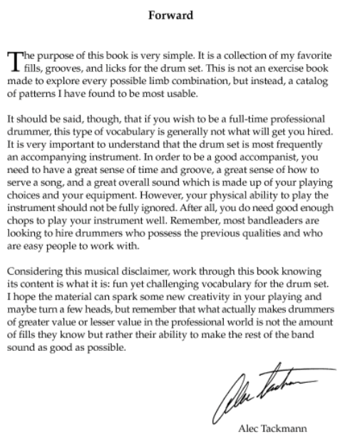
Well, now I know why. Their teacher just published three drumming books (Get them…you’ll love them). The forward of the third book is so inspiring I think we all could learn from it in how we work with our team at work, how we approach our designs, and ultimately how we can delight our users.

Especially the last line:

“What actually makes drummers of great value in the professional world is not the amount of fills they know but rather their ability to make the rest of the band sound as good as possible”

Imagine: While a drummer has the ability to be the loudest one in the group, the most impressive (selfish?), the most showy, what Alec shows is that by serving the band and letting them shine, you will actually be the most valued and sought-out drummer of anyone.

What could it be like if we used all our talents and skills solely to make the rest of our ‘band’ sound as good as possible, rather than to make ourselves look good? How motivated would our teams be? How focused would our designs be? How great will our user’s experience be…because we are serving them, not furthering our own agenda/portfolio?

Do me a favor: As you read the image below, replace “drummer” with “designer”, “leader”, “general manager”, or heck, even “dad”.

After you read it, list below who your ‘band’ is. your family? your team at work? IT administrators? Developers? A youth group? Your users who are skeptical of any software because they’ve been burned in the past? Then, describe what you could do to make the rest of your band sound as good as possible.

Ready? Go.


AlexForward

PS: I’m serious. Go get these books. At least, go read the intro yourself

The Washed-Up Rock Star

Two months ago, I was reassigned from leading a large design project to instead focus on a subset of that same design project. I called it a demotion,  others just viewed it as a shift. For me it was painful. I let it get to me personally.

This is what I wrote to capture my state of mind:

~~~~~~~~~~~~~~~~~~~~~~~~

Sometimes the rock star doesn’t feel washed up.

He feels he has years of ground-breaking creativity left.

But the record company drops him in favor of new talent.

His band mates don’t understand what happened.

He certainly doesn’t understand what happened.

All he knows is he’s got this pent up energy to be creative…be productive…be valued…

…and he’s not being given the opportunity.

At best he’s been offered to play rhythm guitar in the new guy’s band

What does that rock star do?

~~~~~~~~~~~~~~~~~~~~~~~~

…and that’s where I ended it. I didn’t know what to do. I was in a fairly deep valley.

Then, I sought guidance from a former mentor. She provided three things that were extremely helpful:

Empathy, Support, and a Kick-in-the-butt

In one week, she offered:

  • Empathy that what I was feeling was real, and that it was not just a made-up circumstance.
  • Support in options, opportunities, and approaches to overcome
  • A kick-in-the-butt that I need to get over myself and start killing it again.

What a great combination. Turns out that at least for me I need to know that someone has my back…someone is supportive and cares about my well-being. At the same time, I also need a challenge.

Now, I think I have an answer to the washed-up rock star:

~~~~~~~~~~~~~~~~~~~

…What does that rock star do?

He keeps rockin’ it.

He keeps being creative.

He stays curious. Always learning.

If the new guy was put in charge, it’s for a reason. Observe why…it’s most likely an area you can get better at.

Learn, improve, adapt.

He uses his strengths to compliment the new guy all the while adding new strengths.

Before long, the record label notices…or, a new record label notices with better residuals.

Before long, he’s valued, rockin’, and more creative than ever.

~~~~~~~~~~~~~~~~~~~

Do I know how this is going to finish? Nope.

Am I taking the opportunity to improve, learn, stay curious?  Yep.

Above all, I’m taking the long view, that this is just one small piece of my adventure-filled life, and if I remember to learn from both failures and successes, I’ll have a greater, more rewarding, more fun journey that can take me to stadiums to rock out in that I haven’t even dreamed of before.

Here’s to 2015.

Lets Rock It.

Don’t Always Rely On Users?

I write songs. Some I think are pretty good and some are just ok. I’ve been wanting to take the craft of songwriting to the next level.

But, to do that I’m not going to walk the street asking what kind of song users want to hear. I’m going to ask songwriting experts. Those that have experience writing great songs that truly connect with the listener know far deeper what it takes to write a great song, the pitfalls, the rules, and when to break the rules than those that listen to those songs.

Now certainly there is a spark of imagination, a connection to an audience, that creates the core of a great song, but it certainly takes expert skill to craft a song into a work of art that deeply connects with a listener…especially as it works its way through a recording studio to the listener’s ears.
I wonder if the same applies to user experience?
I’m the first to agree that deep user research is required to understand what users needs are, and what can truly delight them. However, lately I wonder if we risk creating something less than exceptional if we focus only on user feedback and not receive peer/expert critique once we enter the design phase?
I’ll admit that a songwriter doesn’t really know how exceptional a song is until it’s played in font of an audience, and I agree that a designer doesn’t know if it’s an exceptional user experience until we see users smile while using it, but I’d bet my next royalty check from Spotify that a users smile will be bigger, an audience reaction louder, and the actual product better if we get peer review and craft the song/UX using that expert critique.
What about you? What kind of peer critique do you run for your designs?

Don’t Do What Users Expect

I know. Seems stupid. “Greg, you’re an idiot”, you say. Well, hear me out.

If you’re like me, as you think through what your product needs to deliver next, the first thing you try to answer is,

“What are customers complaining about?”

…and then work to solve those exact problems. While that does help our users a bit, if we’re on our game, we step back and try to answer,

“Why are customer complaining about that?”

That usually gives us a much better solution that not only solves their immediate problem, but also may solve many related problems. We have a chance to meet or even exceed their expectations since the solution is just better.

But what if we took one more step back and asked,

“Is the way customers want to accomplish their goals really the best way?”

…along with,

“Is there a different perspective we could offer that would completely change how fast/better their goals could be accomplished?”

…and quickly finish with,

“…and how can we solve it with new technology that’s just emerging?”

If we did that, I think we could start hearing the kind of customer feedback we all really want…

…not “Neat. That helps my current need”

…not “Cool. That saves me time to accomplish my current goal”

…but we could start hearing,

“Wow. This is incredible. I didn’t even know that was possible!”

I’m starting to think that taking the extra effort to not only understand our users’ goals, but also think of how to accomplish them from a unique perspective that’s different than everyone else in the market, combined with using new, innovative technology, can truly deliver a killer user experience.

What do you think? What products have you used that don’t meet or exceed your expectations because they completely blew you away because you were in awe at how incredible the product was?


Craft A Killer UX: Don’t Just Fix What’s Broken

In a recent leadership podcast, one comment stood out:

“A great leader doesn’t just fix what’s broken”*

I love that quote and it made me wonder how it applies to user experience. Think about it…how often a user experience stalls because all design time is spent designing fixes to customer problems within the bounds of the current product rather than keeping focused on the overall user experience mission?

A seemingly common pattern in designing a great user experience is to have a grand vision…a mission statement…for a product’s user experience, work feverishly to make its first release as good as it can be, and ship it. However, as soon as the first release is out, customers request to fix pain points or add tweaks to improve what was shipped. Naturally, we want our customers happy so we focus our next releases on solving those pain points.

While reacting to customer feedback is important, how we react could make the difference from a ‘decent’ user experience to a ‘killer’ user experience.

If we are not careful, we can quickly narrow our design focus on how to solve the problem to be only within the bounds of our current product’s capabilities or infrastructure. We forget our user experience mission (or maybe just let it fade?) and as a result the user experience fades as well.

While patching a current UX may solve a customer’s current problem, I wonder if it actually reduces that customer’s overall satisfaction? If we keep accommodating repair requests, we may never have the chance to surprise and delight that customer with the killer UX envisioned in the original mission.

For me, creating a UX mission statement for each product is essential. That mission statement, along with our target personas, drive everything. When we do get customer requests, I find it useful to look at the request through the lens of that mission to see if it should be repaired directly, or if we can surprise and delight them by producing something much better that moves us closer to the overall vision.

What do you think? What other ways can we apply “Don’t just fix what’s broken” to keep improving our user experience?

* From Andy Stanley’s Leadership podcast

4 User Experience Insights I Learned From Training My Puppy

A few months ago I got the family our first puppy. Her name? “Orchid Jane Isabella the Rut Killer”…or Orchid for short.

Like any new project, I’ve immersed myself in learning how to train her so she can be the best dog she can be. Along the way, I’ve learned a lot about our pup, my kids, myself…

…and a lot about how we should treat our users for a great user experience!

1) Positive Reinforcement Gets Better Results
I’ve tried different methods of training including one that’s strictly positive with treats/praise, and one with ‘corrections’, or leash pops, etc. In my experience, while I get pup to do what I want in both cases, I get much better results with positive reinforcement. She seems more eager to please as I guide her to do the right thing and reward her for succeeding. Besides, it seems to me that she becomes much more loyal…because she is choosing to engage with me.

A great user experience does the same. Most times users have choices between our software and a competitors. If users get positive feedback, if they’re guided to success, they become happy, engaged, eager to use the software, and they’ll enjoy the experience much more…and in the end our users will be much more loyal.

2) Take Small Steps And Start With The Basics
I am learning that in order to teach a dog a complex trick, it takes many small steps…and you can’t rush it! For example, my pup can now fetch a toy and if I say “Put Away” she walks to the toy basket and drops it in there. It’s awesome to see. However, that was not something I could teach in one step. She is eager to learn but she needs me to break down a trick into a number of basic steps that she can master…and once she masters each step I can have her perform the whole sequence. Further, if I push her too fast or start with the complex multi-step trick, she would get frustrated, abandon the training session, and just sit in a corner and chew on her bone.

A great user experience is the same: Users need to be shown the basics and feel successful! Once they get a handle of core tasks, they can be guided step-by-step through a more complex task, and eventually do the task on their own. If we don’t provide them with that guidance…and ability to do just the basics first, they’ll get frustrated and abandon our product.

3) Be 100% Consistent
To train a pup, I need to be consistent in reinforcing a behavior. If I’m 100% consistent, she learns the verbal or hand command and is very quick to understand what to do.

A great user experience is the same: If we are 100% consistent in our visual metaphors, navigation path, detailed interaction, our users are quick to understand how to get the most out of our products.

4) It’s All About Trust
It took a while for my pup to trust me. As our training proceeded, she learned I wanted the best for her, that I was here to help her succeed, and yes, that I had treats. It turns out that the more my pup trusts me, the more successful our training will be.

A great user experience is the same: As our users first start out with our product, we need to earn their trust…that we are always accurate, have their best interest in mind, and it doesn’t hurt to have some surprises (some cool capability, automation or innovative and elegant experience). The more our users trust us, the deeper into the product they’ll go and integrate it into their business.

~~~~~~~~~~~~~~

How about you, have you found insight into user experience from dog training or other non-technology sources?

IBM PureFlex Anniversary – Thoughts From The Demo Guy

Exactly one year ago today…

I am in the heart of New York City participating in the biggest product launch of my career. I am back stage surrounded by video and stage production equipment of all kinds and have carved out my own ‘nest’ filled with computing equipment that I’ll be using today.

On stage are two of our leaders announcing the capabilities of PureFlex. I am responsible for the live demonstration during the announce so while I won’t be on stage today, my work will be.

From the FOH speakers I hear “Now I would like to show you the value of PureFlex”.

Here we go!

For the next four minutes we perform a technology-filled 3 person dance: the live demo appears on the stage-right jumbo-tron, the ‘behind the scenes’ animation appears on the stage-left jumbo-tron. Me? I’m playing ‘OZ’ behind the curtain. Leader #1 picks up the iPad that I’ve configured to show the demo to the world. It is connected to our SmartCloud Entry software through a private WIFI to show how easy it is to deploy new workloads into PureFlex systems. “4 clicks” he usually says. But not today. The software was design to run nicely on iPad so today he says “4 taps”.

Leader #2 talks about ‘what happens behind the scenes’ during those four taps…from image deployment with built in expertise…to optimizing resources based on workload needs and real-time performance.

I am monitoring the live demo…and running a redundant live demo on a completely separate iPad and system. AND, I’ve got a backup recording running…ready to switch to either backup instantly in case there’s a problem on stage. I’ve been gigging for years so I know that in a live situation you always need a spare guitar (or demo system) or two as backup.

In the middle of the demo I hear “Oops”. My heart stops. I am about to switch to live backup demo when I hear “Ah…there it is”. My heart is still stopped but a smile of relief appears on my face as the live demo continues to run perfectly.

Before I can breathe the demo is done. I hear applause. Our announce of PureFlex is a success! I mingle with the VIPs and enjoy a small portion of the 35 cases of vodka. The audience files out and after some souvenir pictures I help strike the set.

IMG_4077

Today is a day to remember and has exceeded all expectations! I wonder what tomorrow will bring?

From that day to today I’ve traveled around the world (literally) and performed dozens of pressure-filled live demonstrations showing all that PureFlex offers…from SmartCloud Entry deploying multiple images across multiple hypervisors to a single PureFlex system…to showcasing our latest Flex System Manager user experience on our desktop UI and mobile app. The response? Enthusiastic applause, requests for more, and stories of how our user experience is truly having an impact on customers and partners alike.

It’s been quite a year and I can’t wait to see what the next year brings!


Related Posts Plugin for WordPress, Blogger...