What I Discovered About Creating Successful YouTube Videos

I have had my YouTube channel since 2009, and for a few years it was used for sharing videos to my family and friends.

Wanting to learn more about video editing, I ended up spending quite a bit of time editing movies about our trips, events, and even making music videos of the songs I wrote. I would spend hours learning 2 camera editing with synchronizing sound and all that.

As I expected, I hovered around 100 to 150 views per video.

Then I got the idea to record myself while I was fixing my keyboard and car mirror and post it as a “How-To”. While I spent some time creating and editing these how-to videos, it was far less time than some of my other videos. Further, I needed to fix these things anyway, so the video was not staged or anything…it was capture something I did in real life in hopes someone else could benefit from it.

You know what?

My channel just passed 100,000 views…mostly thanks to these how-to videos. Now, I realize this is a far cry from many hit videos, but it’s far more than I ever planned and I am quite pleased.

How did these videos become popular? I can think of a few reasons:

  • I created content to help someone else
  • I envisioned a larger target audience than just family
  • I captured a moment that many around the world also experience and created an emotional connection to

The last reason is why I think my other two videos have a lot of hits (my girls getting their ears pierced, and my youngest’s first day of getting on the bus)…

…those videos helped nervous young kids around the world see that other kids ‘did it’ and that they would be fine.

Maybe creating a successful video is actually a simple formula:

Create Content to Help Others

Come to think of it, maybe creating a successful life is even simpler:

Live to Help Others

Take a peek at my channel and my popular videos:

http://www.youtube.com/user/GregHint/videos?flow=grid&view=0&sort=p 

What do you think?

Craft A Killer UX: “Listen” To Your UX

I’m a big fan of music.

I love to compose it, play it, listen to it, and share it.

In my years of composing, I’ve used melody, harmony, tempo, and so on to craft the best music I can. In those years I’ve learned to listen, I mean really listen, to the song as it is played to see what’s missing…or what’s extra that needs to get cut. Sometimes the song is lacking energy (fixed with adding a fast guitar rhythm track) or sometimes the song is unfocused (fixed with removing entire tracks).

The result?

A better song.

Critical listening, at least for me, is key not only in crafting the best song I can, but also in crafting the best user experience I can.

Here are a few examples of what I mean:

Hiccups
Install and configure the product yourself. Listen to the product unfold…does it flow well? Are there hiccups that force you to pause, look something up, scratch your head? Is there some step you can remove (automate) or is there guidance you should add?

Numb
Too often I get numb and don’t notice all those irritating shards in the UX that if removed would make for a much smoother experience. Listen to that nagging little voice that moans at every dumb behavior, bad icon, or poorly worded button. If you hear yourself saying, “We will need to add help to describe that”, then you need to fix that area. By listening to that voice, you may find all kinds of things to remove!

Assumptions
Listen for assumptions you make as you navigate your UX. Will your users make those same assumptions? Are there gaps in your UX that you fill with your expertise that your users will trip over?

Harmonies
Many of our product focus on a particular area of our users work. In their world, our product is only one of many they need to use to keep their business running. Listen to how customers work. Is there additional integration, sharing, awareness that your product can add? You don’t need to solve the world’s problems, but if you show you are aware of where they need to go next, users will be much happier.

Those are just a few examples…so how do you listen to your user experience?

How To Craft (And Measure) a Killer User Experience – Virtual Conference Sept 19th

I’m always looking for ways to improve a product’s user experience. Thanks to my friends at Penton Media, I’m excited to announce I am speaking in the 11th annual iPro Developer conference, where I’ll be speaking on user experience…specifically, how to craft and measure a killer user experience!

Here’s a peek:
When you use a product with a killer user experience you just know it. But how do you create one? Even more basic, what elements make up a killer user experience? I’ve worked for years in user experience and regularly get asked that, so I will share how I describe a killer user experience, how it can be measured, and even what emotional responses are at stake. In the end, only our users can describe how they feel about a product’s user experience, and my hope is with this session you will start hearing, “Delightful”, “Awesome”, and even “Killer”.

I hope we can have a vibrant session, and follow up with some great conversations afterwards here on this site.

Check out the conference link for more details.

I look forward to the experience, and hope to see you there!

Craft a Killer UX – The Grin Metric

“If using this software doesn’t put a big ol’ grin on your face, it’s probably not worth it” *

I love this quote. How many times have we been asked to measure user experience, when all along a simple glance at our user’s face would suffice?

Regardless of the research, design iterations, analysis, tutorials, and user testing, if a product makes the user smile…ear to ear…when using it, it’s got a killer user experience.

That grin communicates that the UX surprised them, delighted them, exceeded their I’ve-got-a-crazy-idea-to-make-my-life-a-ton-easier-but-I-doubt-this-product-is-awesome-enough-to-do-it-for-me expectations, and most of all…

…that grin communicates an instinctual delight that only comes from deep emotional impact…resulting in loyalty, trust, and, in the end, a very happy user.

What better goal is there?

* Paraphrased from an awesome article on Recording Review by Brandon Drury…read it!

Craft A Killer UX: Don’t Just Fix What’s Broken

In a recent leadership podcast, one comment stood out:

“A great leader doesn’t just fix what’s broken”*

I love that quote and it made me wonder how it applies to user experience. Think about it…how often a user experience stalls because all design time is spent designing fixes to customer problems within the bounds of the current product rather than keeping focused on the overall user experience mission?

A seemingly common pattern in designing a great user experience is to have a grand vision…a mission statement…for a product’s user experience, work feverishly to make its first release as good as it can be, and ship it. However, as soon as the first release is out, customers request to fix pain points or add tweaks to improve what was shipped. Naturally, we want our customers happy so we focus our next releases on solving those pain points.

While reacting to customer feedback is important, how we react could make the difference from a ‘decent’ user experience to a ‘killer’ user experience.

If we are not careful, we can quickly narrow our design focus on how to solve the problem to be only within the bounds of our current product’s capabilities or infrastructure. We forget our user experience mission (or maybe just let it fade?) and as a result the user experience fades as well.

While patching a current UX may solve a customer’s current problem, I wonder if it actually reduces that customer’s overall satisfaction? If we keep accommodating repair requests, we may never have the chance to surprise and delight that customer with the killer UX envisioned in the original mission.

For me, creating a UX mission statement for each product is essential. That mission statement, along with our target personas, drive everything. When we do get customer requests, I find it useful to look at the request through the lens of that mission to see if it should be repaired directly, or if we can surprise and delight them by producing something much better that moves us closer to the overall vision.

What do you think? What other ways can we apply “Don’t just fix what’s broken” to keep improving our user experience?

* From Andy Stanley’s Leadership podcast

Here’s My Wall Of Experience – What’s Yours?

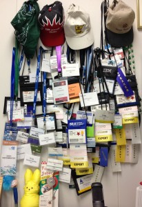
I just moved offices, and had to decide whether to move this:
WallOfExperience
What is it?

It’s my “Wall of Experience” for technical speaking and demoing…layers of badges each representing one or several sessions I gave at a technical conference.

For me, the decision was clear: Move it, Cherish it, Study it.

Why? Because each conference helped me be a better speaker…each session honed my skills. As I pulled each badge down from the old wall and later put it up on the new wall, memories came flooding back…not only about the city/country I was in, but also in what I learned:

It went something like this:

  • Ah, this was my first solo presentation…ever. I learned I could actually do this!
  • This is the one I was so nervous for because the ‘critical customer’ was in the crowd…I learned that honesty and deep technical knowledge beats showmanship
  • Here was the one that I added theatrics…first session went great, second one didn’t…but in the end the attendees appreciated the effort. I learned if you care about your customer, they appreciate it even if it doesn’t totally work.
  • This one was my first keynote…I learned that 10 run-thrus really do make the keynote go smoothly!
  • This is the one where I improvised on the piano…I learned that doing something unexpected keeps your audience’s attention
  • This one I only had one person show up…but he learned a lot because I learned how to personalize a pitch just for him
  • …and on and on.

    Each badge, sticker, pin, ribbon helped shape my skills and unique techniques. I’m grateful for each one.

    I’m starting to think I need to create a wall of experience for other things I’m passionate about to remind me how far I’ve come, what I’ve learned, and that I can still learn something from every single experience.

    I also think we need to start sharing our walls of experience. If I can learn something from your experience, and you from mine, then we both become better.

    How about you? What is your wall of experience? What has it taught you?

    4 User Experience Insights I Learned From Training My Puppy

    A few months ago I got the family our first puppy. Her name? “Orchid Jane Isabella the Rut Killer”…or Orchid for short.

    Like any new project, I’ve immersed myself in learning how to train her so she can be the best dog she can be. Along the way, I’ve learned a lot about our pup, my kids, myself…

    …and a lot about how we should treat our users for a great user experience!

    1) Positive Reinforcement Gets Better Results
    I’ve tried different methods of training including one that’s strictly positive with treats/praise, and one with ‘corrections’, or leash pops, etc. In my experience, while I get pup to do what I want in both cases, I get much better results with positive reinforcement. She seems more eager to please as I guide her to do the right thing and reward her for succeeding. Besides, it seems to me that she becomes much more loyal…because she is choosing to engage with me.

    A great user experience does the same. Most times users have choices between our software and a competitors. If users get positive feedback, if they’re guided to success, they become happy, engaged, eager to use the software, and they’ll enjoy the experience much more…and in the end our users will be much more loyal.

    2) Take Small Steps And Start With The Basics
    I am learning that in order to teach a dog a complex trick, it takes many small steps…and you can’t rush it! For example, my pup can now fetch a toy and if I say “Put Away” she walks to the toy basket and drops it in there. It’s awesome to see. However, that was not something I could teach in one step. She is eager to learn but she needs me to break down a trick into a number of basic steps that she can master…and once she masters each step I can have her perform the whole sequence. Further, if I push her too fast or start with the complex multi-step trick, she would get frustrated, abandon the training session, and just sit in a corner and chew on her bone.

    A great user experience is the same: Users need to be shown the basics and feel successful! Once they get a handle of core tasks, they can be guided step-by-step through a more complex task, and eventually do the task on their own. If we don’t provide them with that guidance…and ability to do just the basics first, they’ll get frustrated and abandon our product.

    3) Be 100% Consistent
    To train a pup, I need to be consistent in reinforcing a behavior. If I’m 100% consistent, she learns the verbal or hand command and is very quick to understand what to do.

    A great user experience is the same: If we are 100% consistent in our visual metaphors, navigation path, detailed interaction, our users are quick to understand how to get the most out of our products.

    4) It’s All About Trust
    It took a while for my pup to trust me. As our training proceeded, she learned I wanted the best for her, that I was here to help her succeed, and yes, that I had treats. It turns out that the more my pup trusts me, the more successful our training will be.

    A great user experience is the same: As our users first start out with our product, we need to earn their trust…that we are always accurate, have their best interest in mind, and it doesn’t hurt to have some surprises (some cool capability, automation or innovative and elegant experience). The more our users trust us, the deeper into the product they’ll go and integrate it into their business.

    ~~~~~~~~~~~~~~

    How about you, have you found insight into user experience from dog training or other non-technology sources?

    Omni-Tasking: An Illuminating Experiment

    This originally appeared in Power IT Pro blog

    Like you, I work in a fast-paced, high-tech business where I am constantly being challenged to increase productivity. For years this has involved multi-tasking across a large set of tasks that seem to constantly need my attention. While I feel I am quite effective at juggling multiple tasks at once, there are times I feel that the results, while complete, are not as satisfying as they could be. However, since the nature of our business holds up multi-tasking as the source of excellence and experience, the pattern has been accepted, and many times, required.

    Recently I had an experience that began to challenge the very notion that “multi-tasking == better”.

    Here is how it happened…

    I’m sitting down to watch the season finale of Glee with my wife…beautiful thing…Netflix ;-). I had timed it just right…kids were asleep, wife was on the couch, and my very yummy evening dessert was freshly dished (heated home-made berry crisp bar with some really great French vanilla ice cream).

    But it wasn’t just the ‘together time’ with the wife, the dessert, and Glee. I had my iPhone next to me, and even my laptop. I WAS SET! I clicked play, and my multi-sensory, multi-tasking late night experience started perfectly as planned.

    And then the wife got up. WHERE DO YOU THINK YOU’RE GOING!?! I shout with my eyes (I’m good at that…especially when she’s walking away from me). She just hears the clink of the spoon and the pause of the show.

    Dang it! I was so frustrated!

    The experience instantly changed from a synchronized multi-tastic media blitz, to a time-wasting “watch the dessert melt while waiting for the missus” disaster.

    I stared at my dessert in despair.

    It started melting. Sadness.

    I stared closer…

    …it continued to melt…Amazing! I had never noticed it before:

    The top of the ice cream was changing in real-time from a jagged mountain-scape into a smooth, soft pillowy cloud-scape. The berry crisp was causing the ice cream bottom to melt faster and created tiny fjords … ending in a micro sea of sweet deliciousness. The first spoonful was exhilarating! The textures I saw translated into a complex symphony playing across my tongue…complete with instruments of cold, warm, smooth, hard, sweet, tart…all within the first taste. The remaining bites were just as exhilarating…but different. As the melting continued, the texture changed, blending of sweet and tart increased, and each spoonful turned into a seamless tastexture that no amount of preparation could have produced.

    I began to feel grateful for what I now refer to as “wifus-interruptus”. All I saw, felt, tasted, heard, smelled, savored…was all because I focused 100% on this one singular event. A multi-tasked version would have resulted in the dessert disappearing without barely tasting it, while at the same time a less enjoyable show with all the interruptions of glancing down at the dessert!

    Then a sudden realization shook my core beliefs: Could my constant push to increase efficiency, experience, exposure, and excellence through multi-tasking actually be decreasing those very goals?

    What if, instead, I focused 100% on one single thing at a time?

    What if I took the time to dedicate all senses, all brain power, every curious and analytical fibre to experience everything that surrounds me like I just did eating that dessert?

    What else would I notice that usually zips by without a neuron of recognition?

    What delightful details evaporate before I can partake in their beauty?

    What insight, skill, or invention escapes me because I constantly swap to the next of 18 things I’m trying to accomplish all at once?

    I started to focus 100% on other things…

    Did you know that the froth on a newly shaken glass of iced coffee bubbles like it’s alive…only to settle into a delicate blanket of protection over the liquid…preserving it for the perfect first taste?

    Did you know a glass filled with iced coffee contains 1000 micro waterfalls? At least that’s what it looks like when the glass spontaneously starts sweating in the 90-degree summer air.

    It was like I was given a sixth sense…focus. I wondered: Is this experience of omni-tasking, this 100% immersive focus of all senses into a single task, the key to unlocking a deeper, fuller, more satisfying experience? In my home? In my work? In everything?

    I continued…

    How about the pond and crick burbling in our walkout? It’s usually a background artifact filling the silent gaps between task switching. What if it was the foreground? The primary focal point? What would I absorb?

    Did you know a chickadee stares at the water like it was the first time he’d seen such wonderful thing? Every time! “WOW! Look at that amazing, thirst-quenching river of life!”…he looks around…not frantic…looking for a friend? Lonely…he looks back: “WOW! Look at that amazing…” Did you know that a yellow finch seems so afraid at being eaten that every time he takes a drink he quick looks all around assuming it’s his last?

    It was like I discovered a super-human power…

    Did you know that 100% focus on your oldest son at the end of the day enables him to talk in a continual stream of consciousness? That through that kind of focus you can ask deeper questions, absorb his passions, likes, dislikes, and in the end show your love for him by just listening, reacting, and laughing?

    ~~~~~~~~~~~~

    Now I’m wondering: Could omni-tasking help in other areas?

    What if I focused 100% on my girls gymnastics training? Could we have deeper discussions on what the ropes feel like as they climb, arms only, in a pike position? Could they convey the feel of chalk on their hands as they spin the bars? What do they see as they flip across the floor?

    What if I listened to my youngest? 100% focus. What would I learn from his crazy-smart brain? What insight would a 7 year old not-yet-jaded-by-assumptions-and-rules child have on a 42 year old too-distracted-by-everything-all-at-once-to-appreciate-much-of-anything brain?

    What if I omni-tasked while writing music? What hidden gem would I discover? What deeper emotion could I share? What funnier lyric could I write?

    What if I scheduled dedicated time throughout the day to omni-task on one work activity at a time? Would I marvel at what I accomplished? Would I find greater insight? Solve harder problems? Provide better leadership?

    Lets get specific: As I leave work the day before, what if I identify just ONE thing to practice omni-tasking…and dedicate 2 hours to it? Heck, even 1 hour of 100% focus. What kind of solution or idea would appear at the end of that session?

    Would I discover that through the self-driven pressure to multi-task I’m cheating myself…and everyone around me…from a deeper, better, happier, appreciative, wonder-filled, higher skilled, more inventive, kinder, better playing, love-giving, attentive, listening man?

    ~~~~~~~~~~~~

    Omni-tasking. I might just have to spend 30 days experimenting…

    Anyone want to join me?

    IBM PureFlex Anniversary – Thoughts From The Demo Guy

    Exactly one year ago today…

    I am in the heart of New York City participating in the biggest product launch of my career. I am back stage surrounded by video and stage production equipment of all kinds and have carved out my own ‘nest’ filled with computing equipment that I’ll be using today.

    On stage are two of our leaders announcing the capabilities of PureFlex. I am responsible for the live demonstration during the announce so while I won’t be on stage today, my work will be.

    From the FOH speakers I hear “Now I would like to show you the value of PureFlex”.

    Here we go!

    For the next four minutes we perform a technology-filled 3 person dance: the live demo appears on the stage-right jumbo-tron, the ‘behind the scenes’ animation appears on the stage-left jumbo-tron. Me? I’m playing ‘OZ’ behind the curtain. Leader #1 picks up the iPad that I’ve configured to show the demo to the world. It is connected to our SmartCloud Entry software through a private WIFI to show how easy it is to deploy new workloads into PureFlex systems. “4 clicks” he usually says. But not today. The software was design to run nicely on iPad so today he says “4 taps”.

    Leader #2 talks about ‘what happens behind the scenes’ during those four taps…from image deployment with built in expertise…to optimizing resources based on workload needs and real-time performance.

    I am monitoring the live demo…and running a redundant live demo on a completely separate iPad and system. AND, I’ve got a backup recording running…ready to switch to either backup instantly in case there’s a problem on stage. I’ve been gigging for years so I know that in a live situation you always need a spare guitar (or demo system) or two as backup.

    In the middle of the demo I hear “Oops”. My heart stops. I am about to switch to live backup demo when I hear “Ah…there it is”. My heart is still stopped but a smile of relief appears on my face as the live demo continues to run perfectly.

    Before I can breathe the demo is done. I hear applause. Our announce of PureFlex is a success! I mingle with the VIPs and enjoy a small portion of the 35 cases of vodka. The audience files out and after some souvenir pictures I help strike the set.

    IMG_4077

    Today is a day to remember and has exceeded all expectations! I wonder what tomorrow will bring?

    From that day to today I’ve traveled around the world (literally) and performed dozens of pressure-filled live demonstrations showing all that PureFlex offers…from SmartCloud Entry deploying multiple images across multiple hypervisors to a single PureFlex system…to showcasing our latest Flex System Manager user experience on our desktop UI and mobile app. The response? Enthusiastic applause, requests for more, and stories of how our user experience is truly having an impact on customers and partners alike.

    It’s been quite a year and I can’t wait to see what the next year brings!

    7 Out Of 6,478 = Good Showing!

    In 2012, IBM was granted 6,478 patents.

    In 2012, I was personally granted 7 patents (totaling 42 US patents)

    What a great company to offer such a great program. I can’t think of a better company perk for someone who HAS to create…like me.

    You see, in most every development project there is the burst of ideas, quickly followed with “Wow, that is a great idea, but we don’t have time to implement that”. If that were the end, there would be a lot of frustrated creative people.

    However, IBM offers a way for the creative to proceed to see just how far that idea can go. Most of these issued patents came from ideas to make our products better that just did not have the funding to get implemented at the time. But since the ideas were unique, and the details of how they could be built were complete, we filed a patent.

    So satisfying to be able to use our creative muscles…thanks IBM!

    Here are the 7 that were granted to me in 2012:

    Moving data between views

    Goal based user interface for managing business solutions in an on demand environment

    Disk with embedded flash memory and disc drive

    Verifying that group membership requirements are met by users

    Implementing dynamic authority to perform tasks on a resource 

    Dynamic and intelligent hover assistance

    Movement-based dynamic filtering of search results in a graphical user interface

    Related Posts Plugin for WordPress, Blogger...