I compose music (Listen here), and years ago I took a film composing workshop. The teacher was Ron Jones and if you don’t know him, you know is music from Star Trek: The Next Generation. He scored the first few seasons including the awesome season 3 finale “The Best of Both Worlds”. He said the key to being a great composer is to always ask this question:
“What’s The Main Thing?”
Meaning, at any moment in time, any measure, any beat, ask yourself:
“What is the ONE thing you want your listener to pay attention to?”
He explained that while humans think we can hear lots of different things at once, when it comes down to it, we really focus on one thing…and if a composer isn’t thinking about the “main thing”…and crafting the music to make the “main thing” stand out, then the listener might focus on something else and not really hear what the composer thinks is most essential to that moment in the song.
The “main thing” in music may surprise you. You might think it’s the melody or the lead guitar solo, but in a rock song, the “main thing” might be the rhythm guitar. In a dance song, the “main thing” might be the snare or kick drum. The “main thing” could change measure by measure from guitar riff, to snare, to vocal, and so on. For example, take the song “Back in Black” by AC/DC. (Note: for those that now categorize me into a certain genre, again, take a listen to what I write…it might surprise you)
Anyway, AC/DC’s Back in Black. That song has one of the best intros in any song. If you listen, the intro quickly moves from string mutes/high hat, to the guitar riff, then adds bass and off it goes into the vocal. But listen again. The “main thing” is actually the snare. Notice how the guitar riff stops so the snare can breathe…there’s nothing interrupting that glorious “SMACK” as the snare (and guitar) set the tone, beat, intensity of the whole song.
The “Main Thing” in Your UX may also surprise you.
While our instinct as creative designers is to want to show off all the cool graphics, colorful gauges, and awesome capabilities your product has, you need to ask yourself,
“What’s the main thing?”
Or more specifically,
“What is the ONE thing you want your user to pay attention to…to focus on?”
It may force you to dim, remove, or alter the flow of your designs so that the user is delighted with how easy your interface is to use; not because there are so many awesome capabilities to choose from, but because they instantly see what they need to focus on.
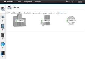
For example, in our newest PowerVC product, we have all kinds of cool capability, pretty gauges, data, and graphics giving the user much-needed information on how to manage their virtual machines. However, when users are first starting out, the “main thing” is none of that…it’s simply a “Plus” icon guiding users to add hosts, storage, and network. Nothing else should have the users’ focus.
I truly think we’re only tapping the surface of what this simple question could do to our user experience. I’m excited to see how much more we all can improve our products by asking this single question.
How about you?
What’s the “Main Thing” in your user experience?

