“Delightful” Doesn’t Have To Mean Simple

At our last design summit at IBM Design, we worked through some pretty great ideas, including how to delight our target user, Maureen, who we defined as an experienced developer who lives and breathes “DevOps”…she needs a much better experience than the one she has now. During one of the “User Empathy” sessions, we were trying to define what would delight her…what would “wow” her…what would make her jaw drop and wonder out loud how she ever got work done without it. We spent quite a while discussing how to simplify her experience and make things more automated…

…when a colleague quipped:

“A ‘wow’ for a craftsman is not a button that “with one click” creates a table. A ‘wow’ is common tools, common grips, common chargers, that enable him to fluidly use his skills and express his creativity”

We all stopped talking.

Yes. Yes. Yes. Yes. Yes. Yes.

We can’t assume that a delightful experience equals a guided “let me help you” approach.

That’s exactly why I use Logic Pro as opposed to Garage Band. I want to express my creativity using my skills to the best of my ability…not press “Create” and have a fake song appear.

Thank you, Johnathan, for this infinitely valuable reminder.

Now That I’ve Experienced Creating Great UX, I…

Over the last several months, I’ve been working with the IBM Design team. Through that interaction I’ve come to improve and refine my measure of great user experience. The project I was just on had it, and it was so exciting…so unifying. We brainstormed on parts of the experience that would add no functionality other than pure delight. We were very proud of what we did. The “It’s like a dream” user quote will stay with me for quite some time.

But now I look around and there are other projects…I have a pit in my stomach…what will it take to change the culture…change our DNA…to make everything we create outstanding…to make everything we create delightful to our users?

I’m not the best designer. By far. But now that I know what working on a team that strives to deliver a great user experience is like, anything less is just sad.

No, not sad.

Heartbreaking.

Don’t Always Rely On Users?

I write songs. Some I think are pretty good and some are just ok. I’ve been wanting to take the craft of songwriting to the next level.

But, to do that I’m not going to walk the street asking what kind of song users want to hear. I’m going to ask songwriting experts. Those that have experience writing great songs that truly connect with the listener know far deeper what it takes to write a great song, the pitfalls, the rules, and when to break the rules than those that listen to those songs.

Now certainly there is a spark of imagination, a connection to an audience, that creates the core of a great song, but it certainly takes expert skill to craft a song into a work of art that deeply connects with a listener…especially as it works its way through a recording studio to the listener’s ears.
I wonder if the same applies to user experience?
I’m the first to agree that deep user research is required to understand what users needs are, and what can truly delight them. However, lately I wonder if we risk creating something less than exceptional if we focus only on user feedback and not receive peer/expert critique once we enter the design phase?
I’ll admit that a songwriter doesn’t really know how exceptional a song is until it’s played in font of an audience, and I agree that a designer doesn’t know if it’s an exceptional user experience until we see users smile while using it, but I’d bet my next royalty check from Spotify that a users smile will be bigger, an audience reaction louder, and the actual product better if we get peer review and craft the song/UX using that expert critique.
What about you? What kind of peer critique do you run for your designs?

Understanding the COMPLETE End-To-End User Experience

We in the tech industry talk a lot about ‘information integrity’, and ‘data security’, and how the world can use information to better their company…so keep it safe!

While true, I loved seeing this photo as a reminder that everything we create has a life-span. Nothing we create will last forever: Our products, our designs, and even the information we generate along the way.

IMG_8335

And while most of us focus on offering solutions on how customers can securely analyze their precious data, this business found a way to be honest: Someday that precious data will not be useful; that destroying data is a natural part of the end-to-end experience.

I wonder how much more delighted we would make our customers if we guide them not only how to discover, try, and buy our products, but also on how to repair, upgrade, and eventually discard our products?

If we face ‘the end’ as a natural part of the full user experience, will we cherish our users more, and not take for granted how precious it is that humans are actually trying to use something we created to be more productive

Maybe if we do, ‘the end’ won’t arrive for quite a long time.

Do You Want to Look Great or Actually BE Great?

I love this quote:

“Do I want to really be great or just be seen as great?”

It was from an Andy Stanley leadership podcast on the importance of inviting feedback, whether ‘constructive’ or positive, in order to make better decisions and be a better leader.

I think this is also essential for crafting killer user experiences.

We are all aware of how ego can affect design decisions, and the resulting user experience. I’ve been guilty of it myself. After all, in the corporate design world, our performance rating is really only as good as our last “hit”…our last user experience we can claim as ours. This reality triggers our instinct to want our own ideas realized solely because it has our name on it, rather than inviting input that would dilute ownership.

What this quote reminds me is that by inviting feedback, we help the design, and more importantly, help our user become truly delighted when using our product to accomplish what they need to.

I can highlight past designs that really made an impact on users, and all of them were better because of the constant feedback we requested from other design experts and users. Every few days we would review certain pieces of the design and work to improve it…see if a panel can be improved, a flow simplified, data visualized, or terms clarified. We would also have ‘design blitz tests’ that brought in experts from various disciplines around the site and just ran through the newly developed UI to test out the designs in mass. We’d then collect the findings and work to improve the product through that internal design test.

So here’s my question: Are we ready to serve our users by dropping our ego and completely focus on making our designs great by inviting feedback? Or, are we more worried about being the sole ‘artist’ so we can fill our portfolio with controlled demos and screen shots that make us merely look great?


Another Reason We Don’t Have Time To Think

Last time I wrote about how our machines still don’t give us the time to think because those same machines inundate us with casual mind-fillers that at best distract us from the time we set aside to think, and at worst provide us an excuse to just not think because thinking requires effort we don’t want to exert.

However, there’s another answer, too…one that happens to me all the time.

For me, these machines are not designed nor built well enough and force me to trouble-shoot…destroying both my “muse” and the time I’ve set aside to think.

How familiar are these examples to you?

  1. I prepare to sketch a design idea, but spend 20 minutes fighting a printer in order to print out my basic grid
  2. I sit to record a guitar solo for 30 minutes, and end up fighting the Firewire connection to get my guitar into Logic
  3. I start writing some thoughts down and 15 minutes into a great essay I get the ‘beach ball of death’ and lose everything

In all these examples, the intended design is awesome and my time to think is there to start with, but something about the tool, usually the connectivity, completely fails. My think-time is snatched away and I end up frustrated and fruitless. To me it just reinforces yet again that a user experience mostly has nothing to do with the shiny UI nor the promised capabilities of the tool, but is completely about the product’s connectivity and reliability, which provides the underlying foundation for a great user experience.

So while we can dream of our machines being our personal trainer to help us think more, we could all be more pragmatic and just test the crap out of our software so that the intended design shines through and isn’t crippled by frustrating connectivity issues essential for an awesome user experience.


Do We Still Need Machines to Do the Work So We Have Time to Think?

This is a quote from an old IBM Design documentary:

“We need machines to do the work so we have time to think”

It’s noble, and inspires us technologists to create better machines to do our daily monotonous work so we have time to think about more noble efforts, more serious problems to solve, and become better humans.

The problem, I think, is that while we’ve succeeded in creating machines that do the work giving us the opportunity to think, we still don’t. It takes effort to think, and a lot of us just don’t want to take that effort. Further, since our new smart machines provide an endless stream of mildly interesting information, games, or even ‘IT administration’ activities like downloading apps, cleaning up messages, reading detailed logs, and other mundane activities, we have ample opportunity to do a new kind of time-wasting work that fills up any time intended for us to think, while at the same time giving us an excuse not to have to think because we were ‘being productive’.

Unlike my dog. For her, she LOVES to learn new tricks and she enjoys thinking hard and figuring out what I want her to do. Teaching her tricks is mentally exhausting for her because she has to think, but she loves it. I love it, too, because I have to think to always be one step ahead of her to reward her, guide her, and when we’re both thinking towards the same goal, it builds our relationship.

I wonder why we waste these “think opportunities”? Is it because our problems are too big? Na. Is it because we are afraid of the companionship we will build together? Maybe. Is it because we’re exhausted? Probably.

Or, is it simply that the machines we’ve built give us unprecedented access to information and ideas but fail in the one primary purpose that these machines were invented in the first place? Did we lose sight that that these machines were built so we actually have time to think?

Is it now that after all this time we realize that quote was wrong…or at least incomplete…that it’s not about the machine but about the experience the machine offers? It’s not the machine’s fault we’re still not thinking. Rather, it’s the user experience those machines deliver that fail in achieving the true goal.

We need time to think. To become a better version of ourselves, to build a better version of today. But thinking takes effort that not everyone is up for.

Maybe our new machines need to be like personal trainers…guiding us to think even though we don’t really want to at that second…forcing us to discard the ‘productive’ activities like sifting through email, logs, playing casual games, and forcing us to think through hard problems. Maybe our interfaces need to ask, “Why are you doing this? Is it helping you solve the difficult problems on your list? As you do this activity, here is a space to list ideas, ‘a-ha’ thoughts so you can build on them later”

Then, at the end of the month, just like a personal trainer, our machines help us look back at all we accomplished…and how much we actually did think.

What do you, well, think?


Isn’t “Horrible UX” A Bit Harsh?

Last time I wrote about my experience at B&H web site and how the “Horrible” user experience eventually saved me $500 and cost B&H $2000.

I wanted to dig in a bit to why I used “Horrible”. After all, a LOT of what I experienced was actually pretty great! It all comes down to how B&H violated the six themes of user experience, and the expectations they set up through those user experiences all with one simple message:

bhoffline

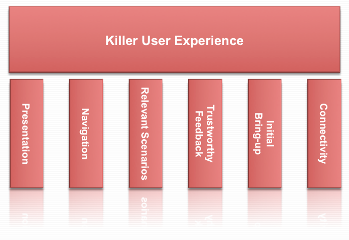
As a refresher, here’s how I wrap my head around user experience: User Experience is composed of six themes: Presentation, Navigation, Relevant Scenarios, Trustworthy Feedback, Initial Bring-up, and Connectivity.

Killer User Experience Themes

Each theme acts like a door. Each door needs to be interesting enough to the user that the user takes a small risk to walk through. The responsibility for the product (and the designer) is that the door through one theme sets the user’s expectations for how the user will experience the next theme.

It’s this failure of handling expectations that made this web site’s user experience horrible. Let’s take a look at how B&H did on each theme:

Presentation: A
B&H’s web site had a great presentation. The home page is easy to look at, has some nice graphics reinforcing what it offers, and I start to build trust that they know what they’re talking about after scrolling down the home page.

Navigation: A
B&H simply helps me navigate to what objects and tasks I want to perform. I searched for iMac, and instantly found it. I also saw “Used” and “Refurbished” and found older ones but decided on a new one (not to mention a nice menu bar at the top showing the kinds of items they sell from video to photo to computer to recording gear…they’re experts at everything!)

Relevant Scenarios: A+
Right next to my iMac was “Add to Cart”, and what makes it an A+ is that instantly after I added it to the cart, I was surprised by being offered free software and discounts on photo editing software I was wanting to buy but didn’t even know they sold.

Trustworthy Feedback: A
I saw my items being added to the cart, saw the total, and I was pumped! I was completely sold not only on the product I was buying but in the way that B&H led me through the transaction with expert reviews, peer reviews, and fast performing “Added to Cart” response.

Initial Bring-up: B+
I had no problems getting started with the web site, but there was a small point of confusion where it didn’t remember my ID so I couldn’t get to my ‘wish list’ as simply as I expected. No biggie. In the end I was led through.

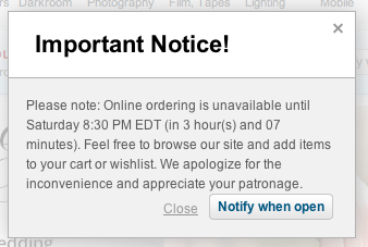
Connectivity: A … then F
I moved between devices and since it offered a user account, I could connect from anywhere and the web site offered instant chat and other features I could have tried.

…and then it told me it couldn’t connect to the check-out process.

Now I actually think this is on purpose, but I can’t think of why. They might as well offer a “Buy from Amazon Instead” button on the dialog above.

I did envision one possibility: I imagine a dimly lit basement in the B&H warehouse downtown New York. A young, but strong intern stands in the basement of B&H with sweat rolling off his back as he turns a heavy crank. His muscles are sore, covered in grime, and quivering in exhaustion. Next to him is a two-story rusty mechanism with 12′ gears slowly turning while creaking and complaining at each crank. Above is a sign that reads, “Turn To Activate Your Internet Checkout Subroutine”, and since he’s the only guy strong enough to turn the mechanism, he needs a few hours each Saturday to rest.

Other than that possibility, I just don’t get it.

This experience does strongly validate the importance of the WHOLE user experience. Companies can invest a ton of money in how a product looks, navigates, that it is relevant to the user, gives feedback, and is simple to get started. However, if the back-end fails at the most crucial point, if the whole reason for the web site’s existence is off-line, everything ounce of investment was a waste of money and the whole user experience is a failure.

Even worse, it lost a customer (at least for that day).

I think that’s why I called it a horrible user experience.

How about you? What do you think the most important part of a user experience is?

Why I Loved This Horrible User Experience

I own a recording studio, and while I’m quite happy with what I’ve recorded and released, I knew it was time to upgrade my studio computer as well as recording software. After many months of research, I decided that my core computer would be a new iMac with 27″ display.

I searched and found the cheapest price new was at B&H Photo and Video for $1695. Awesome! I love their web site and also look there quite a bit for camera stuff. I added the iMac to their cart, found I could buy extra memory, Applecare, and Lightroom 5 at a discount when I bundled it all together. The total came to $2010, just below my budget. Satisfied, I clicked “Check Out”, and I got this message:

“Shopping Cart is down for maintenance…it will be open in 4 hours 27 minutes”

What? This is the Internet! It never closes! I was hoping to get on the last truck so it would ship that day, but since our band was playing that evening, I had to leave it for later.

An hour later, as we were setting up, we started talking and I was reminded about Apple’s refurbished section. “Of COURSE!” I said, “I get refurbished iPhones and iPods from Apple!” I couldn’t believe I hadn’t checked that option out.

When I got home later that night, I went to the Apple refurbished store and found the exact same iMac for $1529!!

I was pumped $170 less! I ordered it right away (after clearing the iMac from B&H’s cart). I then searched forums and found that for recording work, the 8GB of memory should be enough for what I want to use it for, and if it wasn’t, I could add it later. I also found I could add AppleCare later if I wanted, and then found I could get Lightroom for $113 on Amazon…only $30 more than the bundle.

In the end, I saved nearly $500 and didn’t have to hit my budget limit. I was thrilled!

B&H? They lost $2000!!! …and a bit of trust.

So the moral to the story? There’s actually 2:

To the Seller: If you have a web site that brings in money, NEVER put it in maintenance. And if you do, bring in a backup, or at least keep it running during a high traffic time.

To the User: If you encounter a bad user experience, use it as an opportunity to try something different. You may end up a lot happier with what you find and it may save you time and money!

How about you? Have you ever had a similar experience like this?

Killer UX – Go For The Gasp!

Over the years, I’ve grown into an evidence-based designer. While I wish I could ‘cowboy’ along and just design on the fly, I know that the best designs are a result of extremely focused, dedicated, and iterative work.

…and this image is not only filled with evidence, it floods me with emotion:

Leap

Not only because it’s my daughter, but because it is evidence of hundreds, or most likely thousands of iterations to refine her ability to do this leap. I’ve seen her in pain, bleeding, so worn out she could barely walk to her bed, but her passion for showing her most excellent work pushes her to do the best she can…and do it with a smile.

I’ve seen her practice, and even seen her perform this live, but I audibly gasped when I saw this photo.

…which makes me think: What would it mean to our users…how filled with emotion would our users be if they audibly gasped when they saw our designs?

I imagine they would be filled with emotion, loyalty, and some may even be aware of the effort it took to craft a user experience like the one they are seeing.

I guess it comes down to this: Are we passionate enough about our craft to refine and iterate our design until it floods our users with emotion?

I hope so. I’m certainly going to make a run for it in 2014.

How about you?

Related Posts Plugin for WordPress, Blogger...