We Could All Learn From Coffee

I just got an email from Caribou Coffee, and unless it starts with BO and ends with GO, I usually quickly delete them. However, something about the “Uncover our Journey” title intrigued me, so I clicked (full disclosure: I’ve love Caribou Coffee ever since my first napkin had the saying, “Rich and Smooth…because Burnt and Bitter was already taken”).

I opened the email, and clicked on the link…

You can click, too: https://www.cariboucoffee.com/caribou-clean-drink/

What I discovered was an amazing way to communicate integrity, passion, character, deep technical detail, and the ability to execute on a vision through thoughtful design.

I think we could all learn from this (especially those of us in technology).

Transparency
At first glance it looks like a play on words…”see through label?” but right away the site shows its transparency: “Oh, they’re going “open kimono” to show they are proud of their journey and want to share every detail (even the imperfections)

Detail in Design
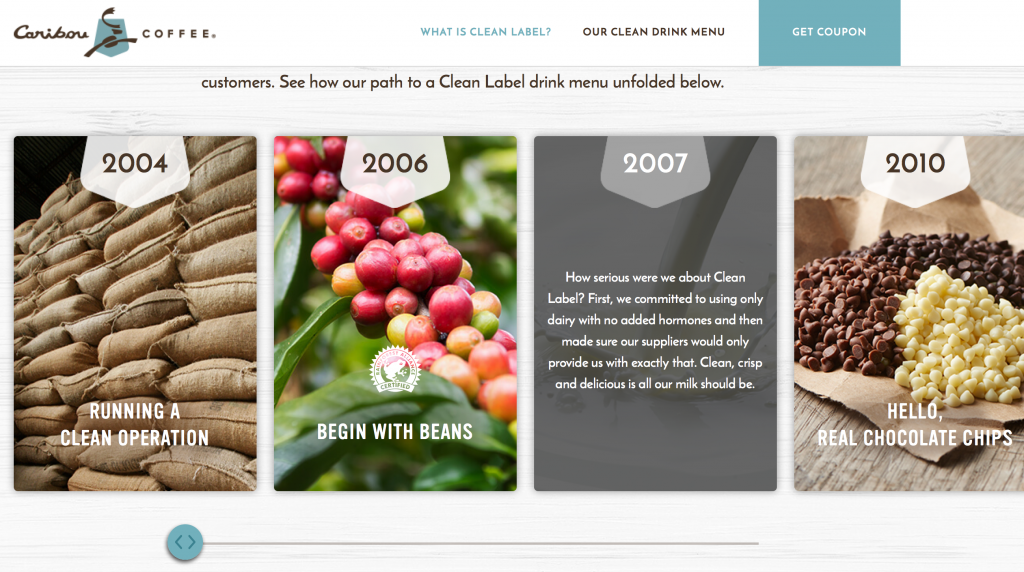
Maybe I’m reading too much into it, but as you scroll to “Our Clean Label Journey”, I noticed three things:

  1. Mouse-over detail: behind the cute marketing message because they know it takes more than shallow words to convince a skeptic…and at this point in the world, I think we are all skeptics of anything
  2. Scroll-Right is optional: They offer details with a scroll-right (or swipe left) to learn every step of their journey
  3. The Scroll Bar Reflects Reality…that Their journey is NOT DONE: I love this part. The design shows a scrollbar … nice big fat scrollbar…and look what happens as you scroll right…it stops before the rail ends. Subtly they are showing that the journey isn’t done yet.

Off-Limits
As you  continue scrolling, you see the “Off-Limits” list where they again have cute slogans with fairly meaty details available for those that mouse over the content

No Guess-Work
This was another favorite: “Guess What Might Be Added  To Other Coffee” section let the user simply scroll and as a whimsical surprise, a very large technical list of ingredients appears on the right. Now, they could have added it in the main space, but how boring!

This was pure design delight. I could see the technical details, and even chuckled when commentary flowed in the list AND the bottom of the page “Almost there…” and so on.

Finally when the list is done, some very subtle yet effective animation throws the “Other” cup aside, and makes the Caribou cup glisten…like it won…but also like it sparkles with purity.

No Detail is Too Detailed
In the menu section there’s a lot of pretty pictures with big words for the main ingredients. Only the most nerdy would scroll through the end of each ingredient list. If you do, then you’re like me and you’ll be further delighted with a “Detailed Ingredients” list that shows every last detail…and then a Culinary Team Note clarifying that even complicated sounding ingredients can be natural.

Finally, there’s a FAQ section that further shows honesty where they list exactly the drinks that are not Clean Label…and what ingredients aren’t, and a nice section on “This sounds complicated…how can it be natural?”

Well done, Caribou. I love the design…and the honesty. Shows you are a great company that cares about its users.

Isn’t “Horrible UX” A Bit Harsh?

Last time I wrote about my experience at B&H web site and how the “Horrible” user experience eventually saved me $500 and cost B&H $2000.

I wanted to dig in a bit to why I used “Horrible”. After all, a LOT of what I experienced was actually pretty great! It all comes down to how B&H violated the six themes of user experience, and the expectations they set up through those user experiences all with one simple message:

bhoffline

As a refresher, here’s how I wrap my head around user experience: User Experience is composed of six themes: Presentation, Navigation, Relevant Scenarios, Trustworthy Feedback, Initial Bring-up, and Connectivity.

Killer User Experience Themes

Each theme acts like a door. Each door needs to be interesting enough to the user that the user takes a small risk to walk through. The responsibility for the product (and the designer) is that the door through one theme sets the user’s expectations for how the user will experience the next theme.

It’s this failure of handling expectations that made this web site’s user experience horrible. Let’s take a look at how B&H did on each theme:

Presentation: A
B&H’s web site had a great presentation. The home page is easy to look at, has some nice graphics reinforcing what it offers, and I start to build trust that they know what they’re talking about after scrolling down the home page.

Navigation: A
B&H simply helps me navigate to what objects and tasks I want to perform. I searched for iMac, and instantly found it. I also saw “Used” and “Refurbished” and found older ones but decided on a new one (not to mention a nice menu bar at the top showing the kinds of items they sell from video to photo to computer to recording gear…they’re experts at everything!)

Relevant Scenarios: A+
Right next to my iMac was “Add to Cart”, and what makes it an A+ is that instantly after I added it to the cart, I was surprised by being offered free software and discounts on photo editing software I was wanting to buy but didn’t even know they sold.

Trustworthy Feedback: A
I saw my items being added to the cart, saw the total, and I was pumped! I was completely sold not only on the product I was buying but in the way that B&H led me through the transaction with expert reviews, peer reviews, and fast performing “Added to Cart” response.

Initial Bring-up: B+
I had no problems getting started with the web site, but there was a small point of confusion where it didn’t remember my ID so I couldn’t get to my ‘wish list’ as simply as I expected. No biggie. In the end I was led through.

Connectivity: A … then F
I moved between devices and since it offered a user account, I could connect from anywhere and the web site offered instant chat and other features I could have tried.

…and then it told me it couldn’t connect to the check-out process.

Now I actually think this is on purpose, but I can’t think of why. They might as well offer a “Buy from Amazon Instead” button on the dialog above.

I did envision one possibility: I imagine a dimly lit basement in the B&H warehouse downtown New York. A young, but strong intern stands in the basement of B&H with sweat rolling off his back as he turns a heavy crank. His muscles are sore, covered in grime, and quivering in exhaustion. Next to him is a two-story rusty mechanism with 12′ gears slowly turning while creaking and complaining at each crank. Above is a sign that reads, “Turn To Activate Your Internet Checkout Subroutine”, and since he’s the only guy strong enough to turn the mechanism, he needs a few hours each Saturday to rest.

Other than that possibility, I just don’t get it.

This experience does strongly validate the importance of the WHOLE user experience. Companies can invest a ton of money in how a product looks, navigates, that it is relevant to the user, gives feedback, and is simple to get started. However, if the back-end fails at the most crucial point, if the whole reason for the web site’s existence is off-line, everything ounce of investment was a waste of money and the whole user experience is a failure.

Even worse, it lost a customer (at least for that day).

I think that’s why I called it a horrible user experience.

How about you? What do you think the most important part of a user experience is?

Why I Loved This Horrible User Experience

I own a recording studio, and while I’m quite happy with what I’ve recorded and released, I knew it was time to upgrade my studio computer as well as recording software. After many months of research, I decided that my core computer would be a new iMac with 27″ display.

I searched and found the cheapest price new was at B&H Photo and Video for $1695. Awesome! I love their web site and also look there quite a bit for camera stuff. I added the iMac to their cart, found I could buy extra memory, Applecare, and Lightroom 5 at a discount when I bundled it all together. The total came to $2010, just below my budget. Satisfied, I clicked “Check Out”, and I got this message:

“Shopping Cart is down for maintenance…it will be open in 4 hours 27 minutes”

What? This is the Internet! It never closes! I was hoping to get on the last truck so it would ship that day, but since our band was playing that evening, I had to leave it for later.

An hour later, as we were setting up, we started talking and I was reminded about Apple’s refurbished section. “Of COURSE!” I said, “I get refurbished iPhones and iPods from Apple!” I couldn’t believe I hadn’t checked that option out.

When I got home later that night, I went to the Apple refurbished store and found the exact same iMac for $1529!!

I was pumped $170 less! I ordered it right away (after clearing the iMac from B&H’s cart). I then searched forums and found that for recording work, the 8GB of memory should be enough for what I want to use it for, and if it wasn’t, I could add it later. I also found I could add AppleCare later if I wanted, and then found I could get Lightroom for $113 on Amazon…only $30 more than the bundle.

In the end, I saved nearly $500 and didn’t have to hit my budget limit. I was thrilled!

B&H? They lost $2000!!! …and a bit of trust.

So the moral to the story? There’s actually 2:

To the Seller: If you have a web site that brings in money, NEVER put it in maintenance. And if you do, bring in a backup, or at least keep it running during a high traffic time.

To the User: If you encounter a bad user experience, use it as an opportunity to try something different. You may end up a lot happier with what you find and it may save you time and money!

How about you? Have you ever had a similar experience like this?

4 User Experience Insights I Learned From Training My Puppy

A few months ago I got the family our first puppy. Her name? “Orchid Jane Isabella the Rut Killer”…or Orchid for short.

Like any new project, I’ve immersed myself in learning how to train her so she can be the best dog she can be. Along the way, I’ve learned a lot about our pup, my kids, myself…

…and a lot about how we should treat our users for a great user experience!

1) Positive Reinforcement Gets Better Results
I’ve tried different methods of training including one that’s strictly positive with treats/praise, and one with ‘corrections’, or leash pops, etc. In my experience, while I get pup to do what I want in both cases, I get much better results with positive reinforcement. She seems more eager to please as I guide her to do the right thing and reward her for succeeding. Besides, it seems to me that she becomes much more loyal…because she is choosing to engage with me.

A great user experience does the same. Most times users have choices between our software and a competitors. If users get positive feedback, if they’re guided to success, they become happy, engaged, eager to use the software, and they’ll enjoy the experience much more…and in the end our users will be much more loyal.

2) Take Small Steps And Start With The Basics
I am learning that in order to teach a dog a complex trick, it takes many small steps…and you can’t rush it! For example, my pup can now fetch a toy and if I say “Put Away” she walks to the toy basket and drops it in there. It’s awesome to see. However, that was not something I could teach in one step. She is eager to learn but she needs me to break down a trick into a number of basic steps that she can master…and once she masters each step I can have her perform the whole sequence. Further, if I push her too fast or start with the complex multi-step trick, she would get frustrated, abandon the training session, and just sit in a corner and chew on her bone.

A great user experience is the same: Users need to be shown the basics and feel successful! Once they get a handle of core tasks, they can be guided step-by-step through a more complex task, and eventually do the task on their own. If we don’t provide them with that guidance…and ability to do just the basics first, they’ll get frustrated and abandon our product.

3) Be 100% Consistent
To train a pup, I need to be consistent in reinforcing a behavior. If I’m 100% consistent, she learns the verbal or hand command and is very quick to understand what to do.

A great user experience is the same: If we are 100% consistent in our visual metaphors, navigation path, detailed interaction, our users are quick to understand how to get the most out of our products.

4) It’s All About Trust
It took a while for my pup to trust me. As our training proceeded, she learned I wanted the best for her, that I was here to help her succeed, and yes, that I had treats. It turns out that the more my pup trusts me, the more successful our training will be.

A great user experience is the same: As our users first start out with our product, we need to earn their trust…that we are always accurate, have their best interest in mind, and it doesn’t hurt to have some surprises (some cool capability, automation or innovative and elegant experience). The more our users trust us, the deeper into the product they’ll go and integrate it into their business.

~~~~~~~~~~~~~~

How about you, have you found insight into user experience from dog training or other non-technology sources?

Flip Your Focus: Serve Customers Through Social Media

Recently I was asked “Can you explain the professional benefits for a corporate employee engaging in social media?”

My response surprised me, and I thought you might find it interesting as well…

~~~~~~~~~~

Engaging in social media professionally does benefit you directly, but as I think through my experience, I find it becomes especially rewarding when you flip the focus from how it benefits you to how it benefits our customers.

Why flip focus?

Because our customers deserve our very best, and if we are involved in social media for  our own benefit, then our conversations, content, and perspective will always have an ulterior motive. We may make more sales or become more well-known in the industry in the short term, but the relationship with our customers will remain shallow with no lasting impact nor loyalty.

The social web is filled with “Look at me!” blogs and sites and tweets. It’s quite self-serving and it can take our users some time to tease out useful and unbiased information that they can use. However, if we start with “How can I serve you?” then their interest rises at the potential of rich, unbiased, relevant content.

When we focus on serving our customers through social media, their benefits include:

Customer Benefits:

  • Customers will gain better insight from your expertise in how to do their job better
  • Customers will trust that the conversation, tip, recommendation has their best interest in mind
  • Customer loyalty will increase as they realize they have real human relationships with experts that create our products/services.
  • Customers will share your expertise with their peers
  • Customers will feel relevant because you asked them to give honest feedback about your product/service

Notice that while our customers benefit, at the same time you benefit in even greater ways:

Your Benefits:

  • Trusted Industry Expert: You will become known in the industry as an expert, but even more importantly, a trusted expert
  • Real-World Impact: You will have real customer quotes to show your impact you’ve had over the year
  • Greater Purpose:  Because you help real humans in their work with your expertise, you will feel a greater purpose in your work. Instead of feeling like a small cog in a large machine, to a group of customers you are the expert in your area that helps them succeed
  • Improved Product: You will get unbiased feedback about your product/service that you can fold into your next release, thereby improving it for all customers

Like most things in your professional life, the more you put into your social media presence the more you get out of it. And at least in my experience, the more you focus on how to help others succeed through social media, the more personal reward you end up with.

Question: How do you serve customers through social media?

User Experience – Communicating A Core Principle

In a recent talk I gave, I described our overall mission for Flex System Manager as, “To provide a best-of-breed experience in managing physical/virtual resources across compute, storage, network so that business-critical workloads can thrive.”  I also described that, in order to achieve that mission, we defined a number of core principles that we drive to and measure against.

I had just finished showing off our new mobile app and enhanced UI in our new Flex System Manager release, and it was clear from the audience applause that we are delivering some really great enhancements that looks pretty darn cool.

I then got to our core principle, “Enhanced User Experience”.

To help the audience fully understand what we mean by user experience, here’s what I said:

“User experience is far more than shiny objects and cute iPhone apps. To us, it’s also about reducing the time to set up the whole PureFlex environment and manage it…it’s about providing automation users can trust so that when they press a button, they trust our software to relocate and optimize their production-level workloads…it’s about providing relevant actions and showing relevant data to help users trouble-shoot and make the decisions they need to manage their data center”

Yes, ‘shiny’ is important, but ‘fast’, ‘trustworthy’, ‘relevant’…that’s what makes a great, and lasting, user experience.

How about you, how do you communicate what user experience means to you?


Related Posts Plugin for WordPress, Blogger...