How many times have you truly been surprised at a user experience? Not in the “I can’t believe they shipped this piece of junk”, but in the “I’m giddy with delight…I want to bear-hug the lead designer of this project!”?
It just happened to me at the Musical Instrument Museum in Phoenix, Arizona.
As I described in my design session “How to Craft (and Measure) a Killer User Experience”, a user experience goes far deeper than just shiny objects and fancy artwork. User Experience, at least the way I’ve come to understand it, includes six themes, or doors, the user walks through (Figure 1): Presentation, Navigation, Relevant Scenarios, Trustworthy Feedback, Initial Bring-up, and Connectivity…and they are all essential to create a killer user experience.
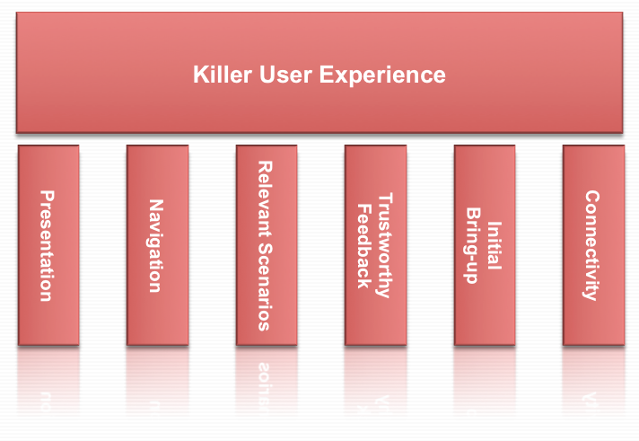
Figure 1: Killer user experience themes
So how was the experience at MIM? Let’s dig in…
My wife and I walk into the MIM, and pay for our tickets. Unlike the Louvre, the audio guides (earphones and device) come with the ticket. A small thing, but nice!
We walk to a nearby gallery filled to the rafters with guitars…my love language. After studying my favorite (Figure 2, a Paul Reed Smith Double Dragon), we walk up stairs to the museum.
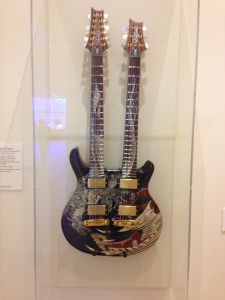
Figure 2 – My favorite guitar
We put our headphones on, and as we walk to the first display, we suddenly start hearing what these instruments from 19th century Africa sound like. The audio connects seamlessly and synchs so we can hear, and see on the TV how they play the instruments as well.
WONDERFUL!
I can’t tell you how delightful that was. No numbers or channels to figure out, no fancy touch-screen to palm and screw up, nothing. The mere act of moving closer to the TV automatically immerses us into the musical culture right in front of us (Figure 3).
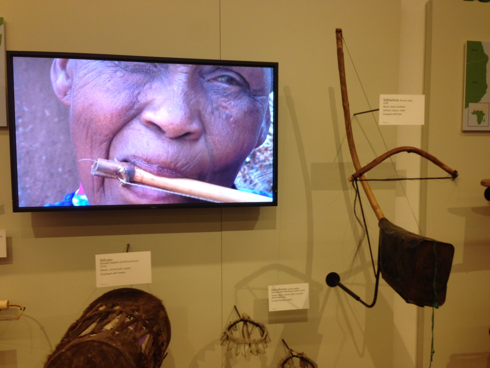
Figure 3 – An awesome display blending sight, sound, and history
Their attention to detail was impressive. For example, as I walked towards the display, the music faded in at a smooth, natural rate…reinforcing that this whole experience should be a leisurely stroll through the music of the world. As I walked away…or as the device switched between two nearby TV audio signals, it calmly faded, and once out, the next audio faded in. This reinforced that the designers knew experiencing the music was the top focus, rather than just making sure the technology worked. I actually expected an abrupt beginning and end, but instead I was gently waved goodbye by the display I was leaving and warmly greeted by the display I was approaching.
As a side note, it was almost erie to take my headphones off and hear complete silence..even though hundreds of people were strolling throughout the museum.
What the designers at MIM figured out is how to provide an effortless connection to experience musical instruments from around the world. I mean effortless…walking closer to a display activating the audio? With nothing for me to dial in? And not having to share audio with others or have 198 displays blaring its own audio for all to hear? Yes, effortless.
Was it perfect? Nope. But pretty darn close. There were a few times that I could not sync to the TV. 98% of the time the device worked flawlessly, but when it didn’t I did feel a bit at a loss. Since there were minimal controls on the device (start, stop, volume), the only thing I could try was to press stop and start in hopes it would re-synch. When that didn’t’ work, I’m sure I looked a little funny doing a little 2-step as I moved farther away then closer to the display in hopes it would synch up 🙂 I even found myself waving the device towards the TV and wondering if the ‘front’ of the device should be pointing directly at the TV or not.
Of course, as I write this, my wife asked, “didn’t you see the transmitter at the rim of the display that listed the order of artifacts?”
One other minor issue had to do with the “Relevant Scenarios” and “Navigation” user experience themes. Being a musician, I wanted to play these awesome instruments…like these from South Africa. (Figure 4).
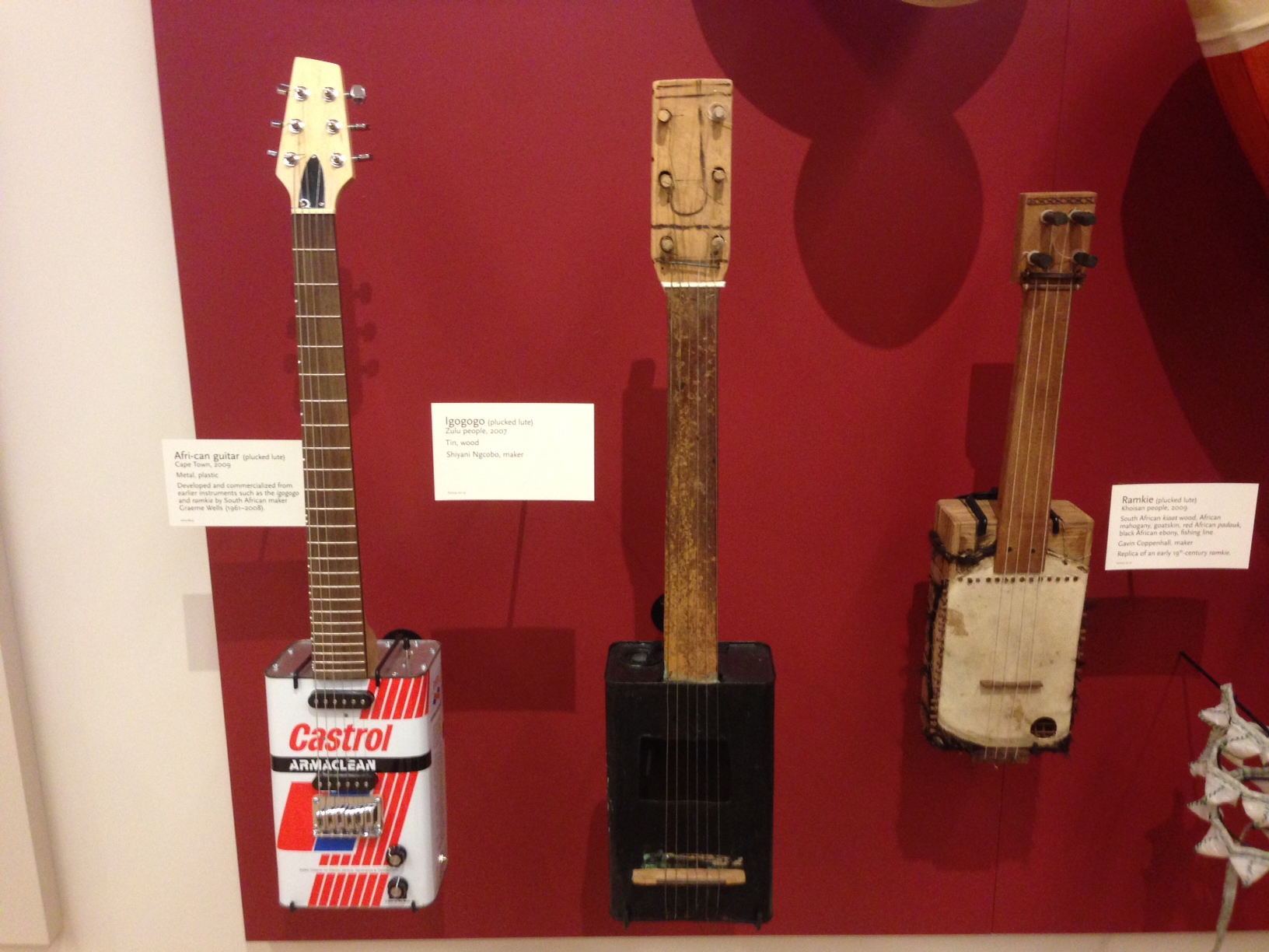
Figure 4 – These were screaming for me to play them!
The problem was, I wasn’t told about the “Touch-It” lounge downstairs until we found it later. It would have been awesome to have a little “Touch-It” logo next to the display label for that instrument…so I knew instantly I could either play it or something similar to it later on.
So, with these “Hintervision Killer UX” themes, let’s see how MIM did:
Presentation: A
Navigation: A-
Relevant Scenarios: A
Trustworthy Feedback: A
Initial Bring-up: A+
Connectivity: B+
Overall: KILLER!
I realize that user experience is usually referring to software interfaces, but I think we all agree that more and more interaction with our environment does not have a detailed screen to look at. The designers at MIM should be awarded with their awesome, relevant, delightful, and in the end, killer user experience.
How about you? Have you visited the Musical Instrument Museum? What did you think?